(before you read - this case study looks cooler in dark mode 🌚)
I. Business Problem
Adesa Clear's mobile app lacks advanced features that could enhance user engagement and bidding efficiency, limiting its competitiveness in the digital auction market. Without innovations like interactive features on a lock screen and embedded system widgets, the app risks losing traction to more agile competitors in the potential future offering quicker and more interactive experiences.
II. User Problem
Users find the current mobile app less convenient for real-time bidding, as they must open the app to see or place bids. This adds unnecessary friction, reducing the overall ease and engagement in the auction process, particularly for frequent bidders who need quicker access.
How might we incorporate seamless, real-time bidding features for the Adesa Clear mobile experience to enhance user convenience and engagement, allowing customers to bid more efficiently without needing to open the app?
III. Alignment with Stakeholders
We held a kickoff with design, ENG, and product to gain clarity with the project scope. How many features are we trying to create? Where does this fall in our list of priorities? What is the timeline for this project? Also, what are some ideas we have?
My stakeholders love jam sessions because it exercises a part of their brain that they don't use on a day to day (the creative & artsy side) and we always have a blast! Here is a screenshot of the Figjam session we did during our kickoff:

IV. Our Design Goals
After project kickoff, we narrowed down our design goals into three categories that ties in with our product and user's needs.

V. Understanding Apple's Design System
Apple has very specific rules and use cases for their widgets, dynamic island, and live activities. I was least familiar with the concept and different patterns of widgets, so I've spent the most time researching deeper into it. Here are some of the findings of my research on widgets.

Things to consider in the ideation process -
Principles
- Personal: emotional connection with a piece of the app
- Informational: commonly repeated action in the app
- Contextual: predicts the need/next steps
Things to consider in the creation process -
Size and interaction of widgets
- Small: single tap target brings user to a specific part of the app, and only pack 4 pieces of info MAX!
- Medium: multiple tap targets
- Large: multiple tap targets
Content and personality
- What are people looking for when they launch the app?
- What are distinct items of info people find useful in the app?
- There are 2 patterns for content in widgets (see below).
Layout that expands across all 3 sizes:
Layout that is completely unique across all sizes:
Patterns: These are the common patterns of widgets. There's a mix of single-item and denser multi-item summary layouts.

Things to keep in mind -
Widgets are all about content!
It is not recommended to put the app icon in the widget.
Don't have logo name inside the widget because it's repetitive.
Don't use copy that instructs the user to do something. Show rather than tell.
Remember to account for dark mode and have placeholder empty states.
When designing for each size, make sure not to scale up your smaller widget into your larger widget.

VI. Recognizing Patterns
Across our web and mobile bid cards on the search results page, vehicle details page, and bid management, there are consistent patterns in how bidding amounts, year/make/model, and bidding status are grouped. These elements are placed in close proximity to one another and are the key details dealers focus on at first glance.
These are the bid cards across web:

And these are the bid cards across mobile:

I decided to prioritize widgets before dynamic island, live activities, and home notifications because it required different sizes and layouts. Dynamic island and live activities were straight forward because we decided to have those two features reflect the last 5 min of sale. Home notification interactions were also an easy solve because the call to actions were already finalized per notification type from our past designs.
VII. Widget Iterations
Within a week I went through multiple design iterations, incorporating feedback from stakeholders and continuously returning to the drawing board to explore different design approaches. Considering the patterns of our bid cards, I began exploring how widgets could serve a meaningful purpose.
These are the explorations for small widgets. On the left I converted the bid status badges to smaller icons to be expressed better in tighter widget spaces. The green selection highlights the option that was most liked by all, and the orange was a 'maybe' choice.

Due to space constraints, it was more efficient to provide a high-level summary of the number of vehicles categorized by bidding status rather than listing each vehicle individually. It would be ordered from the most time sensitive (Outbids) to least (Listing Closed). The layout of the green selection not only captured this effectively but also aligns with studies showing that users tend to focus 80% of their attention on the left half of the page and only 20% on the right, reinforcing the design's strategic placement.
In the explorations for medium widgets, there were 2 versions I explored that reflected the Search Results Page and Bidding functions. The left side shows version 1 and the right, version 2.

Version 1's orange selection was a popular choice by stakeholders because it was a more compact view. However, because medium widgets have the functionality to have more than 1 tap area, making the space more breathable and finger friendly was priority. It read better from left to right, and the up and down carot buttons gave flexibility for our users for more listings.
Version 2 came together quite easily. I referenced Adesa Clear's mobile bid management cards and took some pieces out, where users can view more listings through the right buttons or press 'Bid' to open that vehicle listing on the app.
Lastly, large widgets.

We opted for a design with a denser information layout, displaying only the essential details. While larger images would have been a nice addition, showing more listings within the large widget framework better supported our workflow.
VIII. Dynamic Island / Live Activities / Home Notifications
Dynamic island and live activity designs reflect the last 5 min of sale. Explorations were more simple and straightforward, with less guidelines to follow.
This was the nitty gritty guidelines of dynamic island:

Live activities guideline was straightforward: maintain 24px padding around all borders. Here's some explorations for dynamic island and live activities. Tapping on any of the surface would lead the user directly to 'My Bids' page.

For home notifications, a long press reveals a dropdown of CTAs, each directing users to the SRP, VDP, Purchases, or Checkout page.

IX. Final Designs
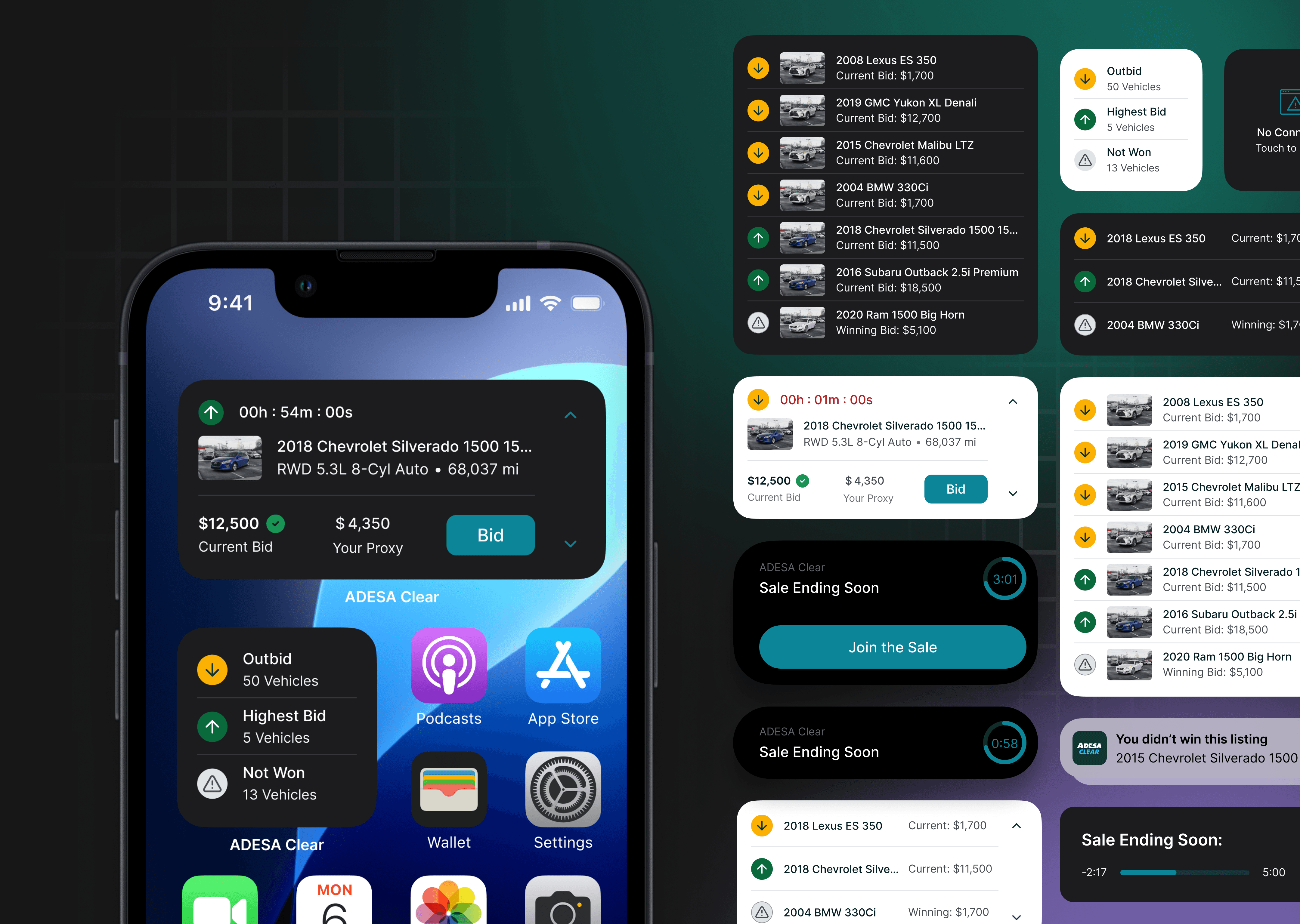
None of our competitors utilize IOS features. As the first auction platform to integrate iOS features, it put us at a huge advantage for being a tech-forward company.

Widgets don’t update in real time; instead, they refresh every few minutes or hours. This is where Dynamic Island and Live Activities bridge the gap, acting as real-time alerts in the final five minutes of a sale. With interactive and easily accessible features on the lock and home screens, users stay more engaged and are alerted in real time!

This is a happy path of installing the widgets on home screen.

And this is what notifications, dynamic island, and live activities will look like in situ!


X. Stakeholder Response?

🌟 Takeaways
This project made me realize how much I enjoy building things from ground up. I thrive on exploring new concepts, thinking outside the box, and learning about the intricacies of different design systems. It was a refreshing change of pace from my usual day-to-day work, and having a mix of projects like this keeps my creativity sharp and my problem-solving skills diverse. I realized balancing various types of projects helps me grow as a designer and keeps my work both exciting and fulfilling.