🚀 A month after the beta release, Purchases page had 142 engaged users with a total of 2,171 successful sales.
I. Project Introduction
Context on Adesa Clear
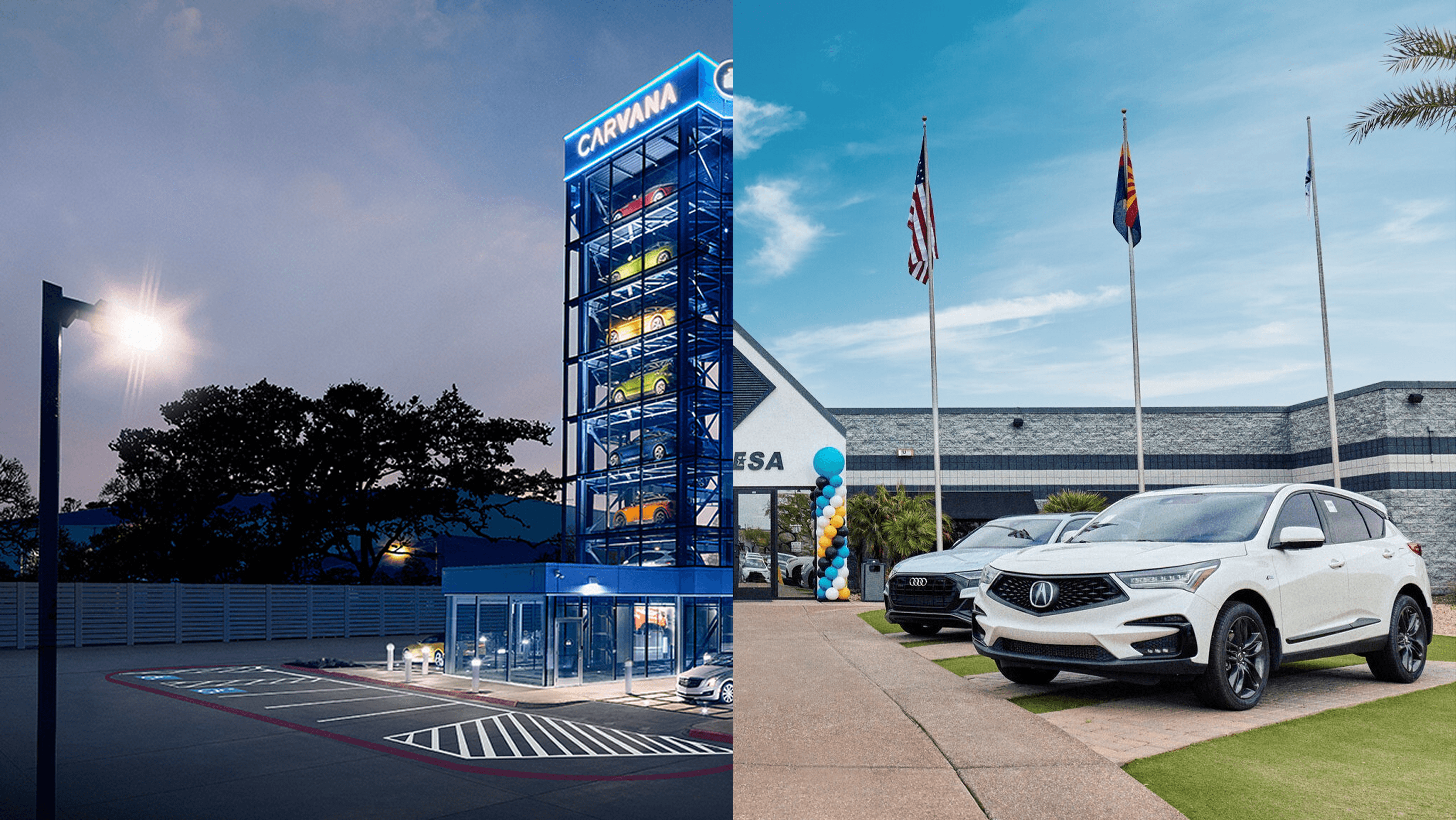
When Carvana acquired Adesa in 2022, its auction business was declining due to competition from digital auctions, KAR's shift to online sales, and Covid's impact on physical auctions. Initially, CarvanaACCESS was used to dispose of vehicles that didn't meet Carvana's high brand standards, but after the acquisition it was rebranded as Adesa Clear, gaining 56 physical auction locations across 4,000 acres. To regain market share and improve profitability, Carvana launched the rebranded Adesa Clear in 2023, seeing early success but still aiming to replace Adesa's original outdated platform, improve the buyer experience, and expand Adesa Clear nationwide in 2024.
Business Problem
Adesa Clear faces strong competition from digital auction platforms like Manheim. Despite the acquisition, outdated technology and a shifting market have resulted in stagnant sales and low adoption of the new platform. To regain market share and reduce reliance on competitors, Adesa Clear must modernize the Purchases page to create a seamless, reliable post-purchase experience. Enhancing this final step will not only improve the buyer experience but also build trust, encourage repeat customers, and drive long-term engagement with the platform.
💬 If you'd like to explore in-depth of Adesa Clear's history, learn more about our users, and understand our indirect competitors, click here for more information.
User Problem
Dealers need a fast, transparent, and efficient way to manage post-auction purchases. The current process lacks easy access to key details, causing frustration and pushing users to competitors with better workflows. A streamlined Purchases page will enhance convenience, improve retention, and increase engagement.
How might we provide our automotive dealers with the most efficient post-purchase experience that is transparent, efficient, and complete?
II. How are we measuring success?
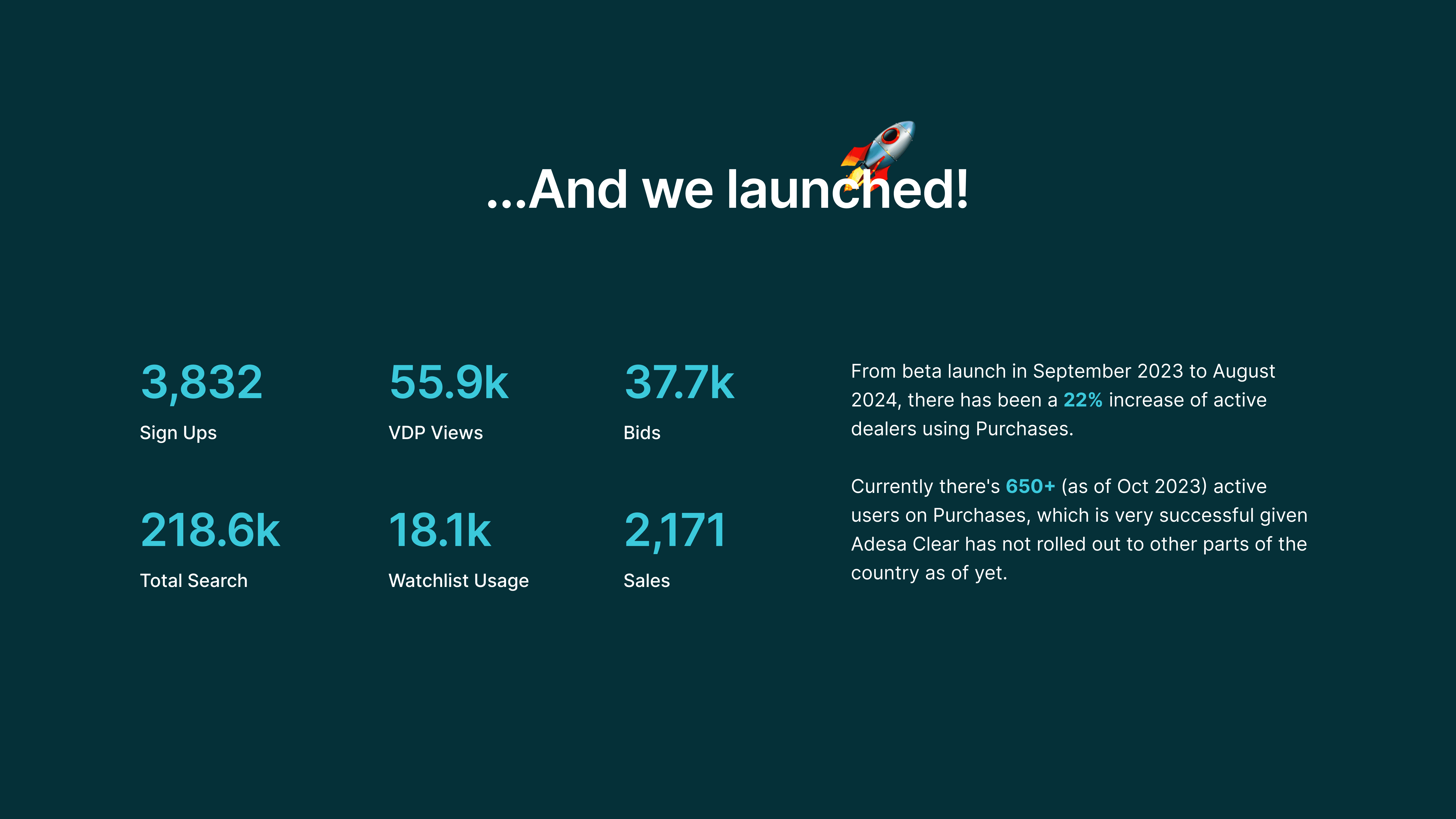
Increase percentage of checkout on Adesa Clear by 850% (~35.6K sales) by Q1 of 2025. For reference, from the beta launch in September 2023, there has been a total of ~4K+ sales.
III. Gathering Data
To foster alignment, gather data, and clarify priorities across product managers, engineers, and design, I facilitated a FigJam session to explore and document what’s currently working well at Adesa and identify areas for improvement. This was a necessary step before rebranding to Adesa Clear.
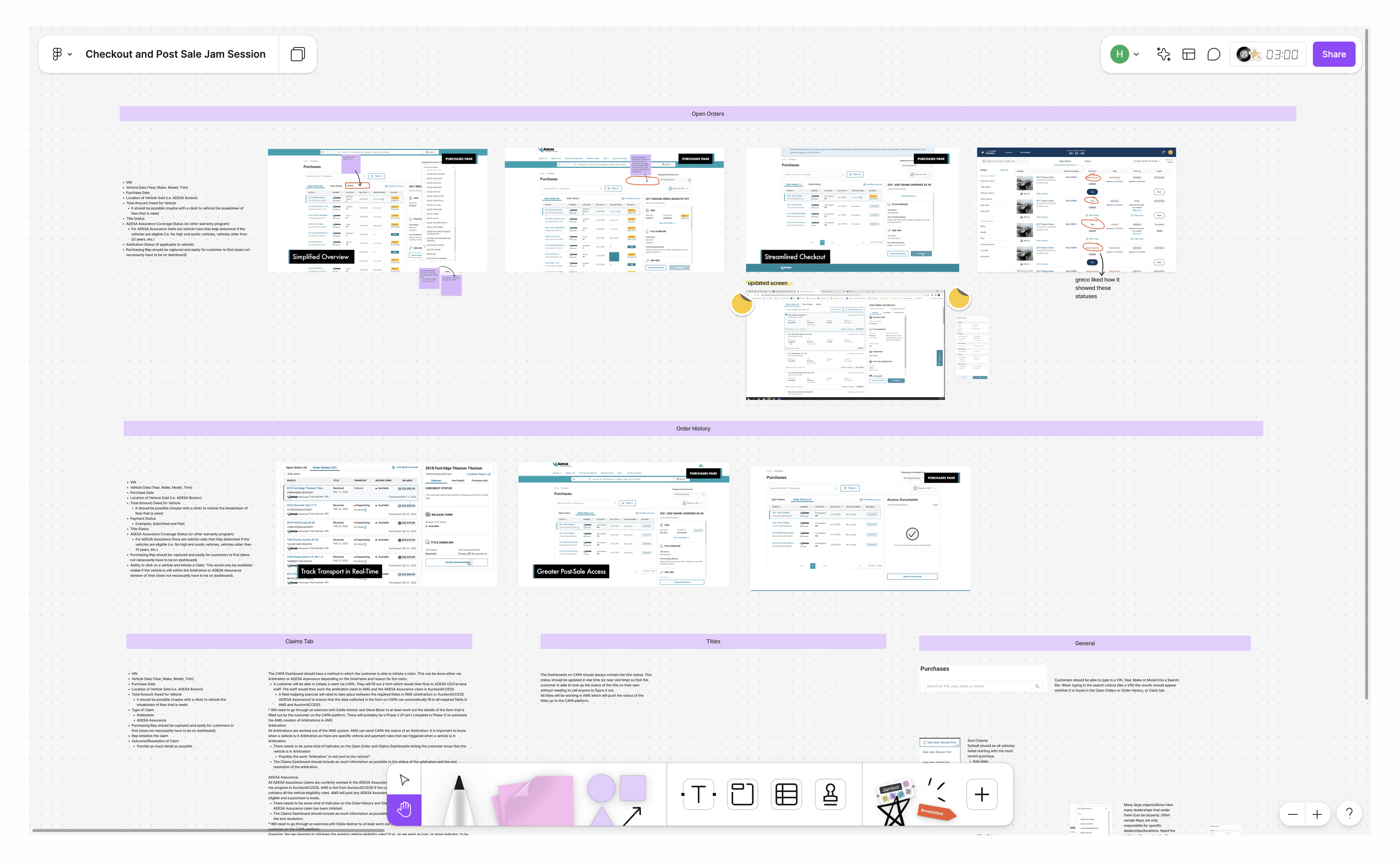
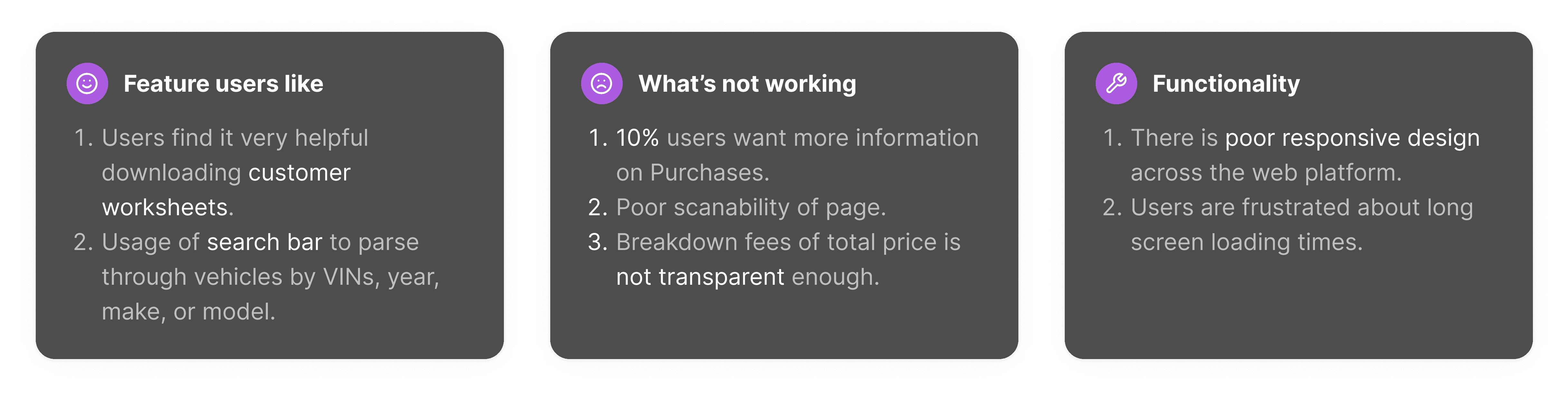
Here is a high level summary of some of our current user feedback on Adesa's purchases experience
IV. Direct Competitor & Feature Analysis
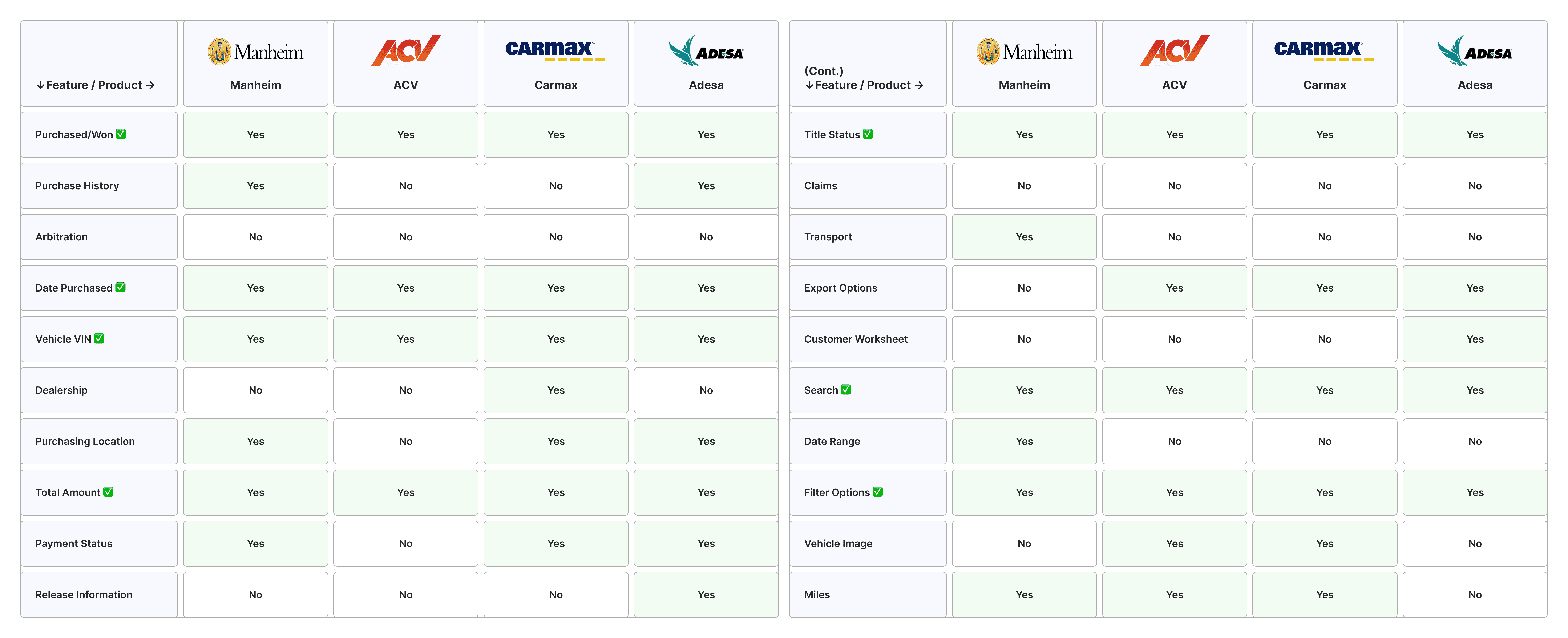
To refine our design objectives and gauge our competitive standing, we carried out an in-depth analysis of our direct competitors.
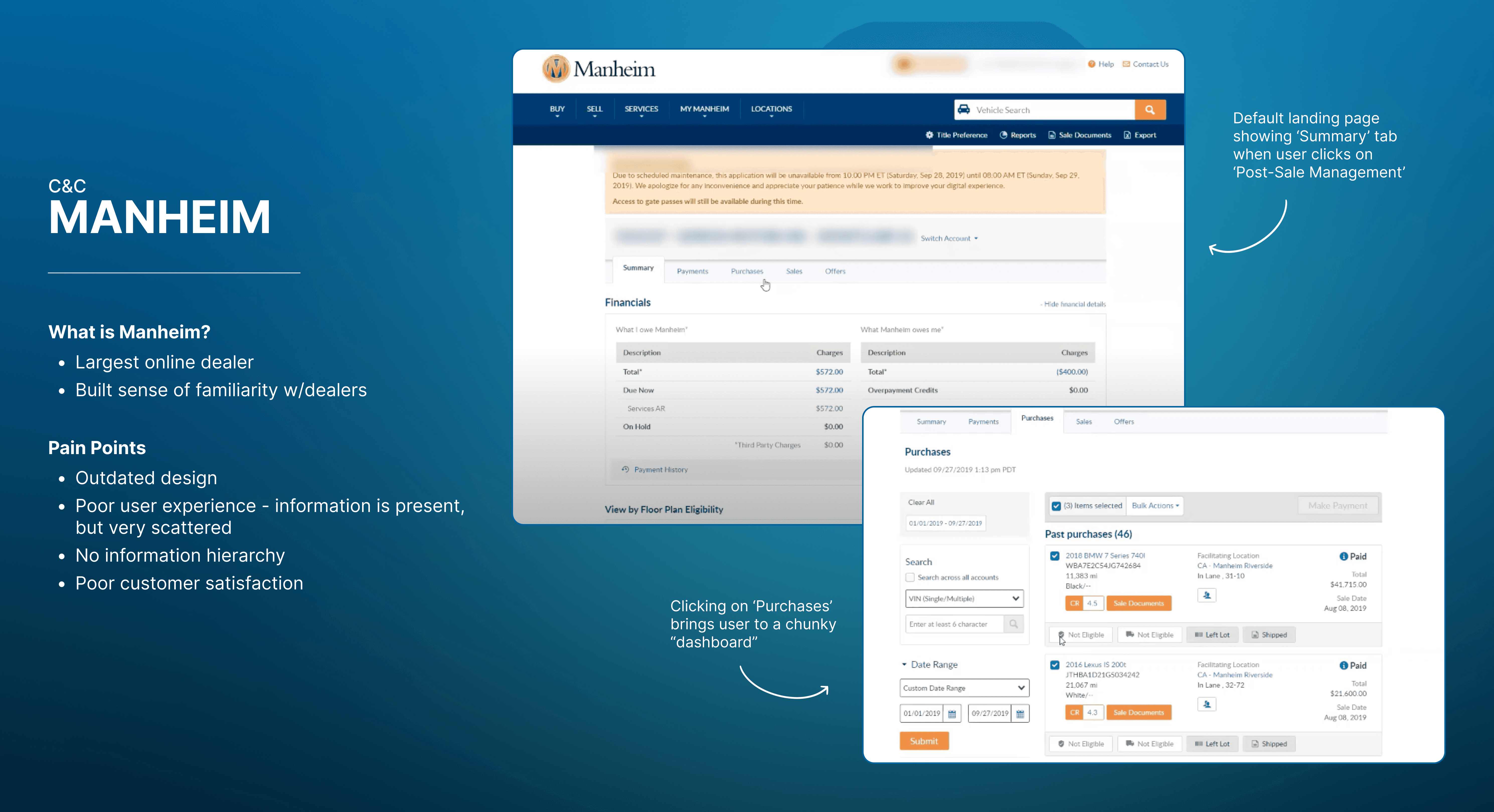
In the wholesale auction space, three direct competitors stand out. Among these, Manheim is the most prominent because they are widely recognized by dealers for its robust platform, extensive network, and longstanding industry reputation.
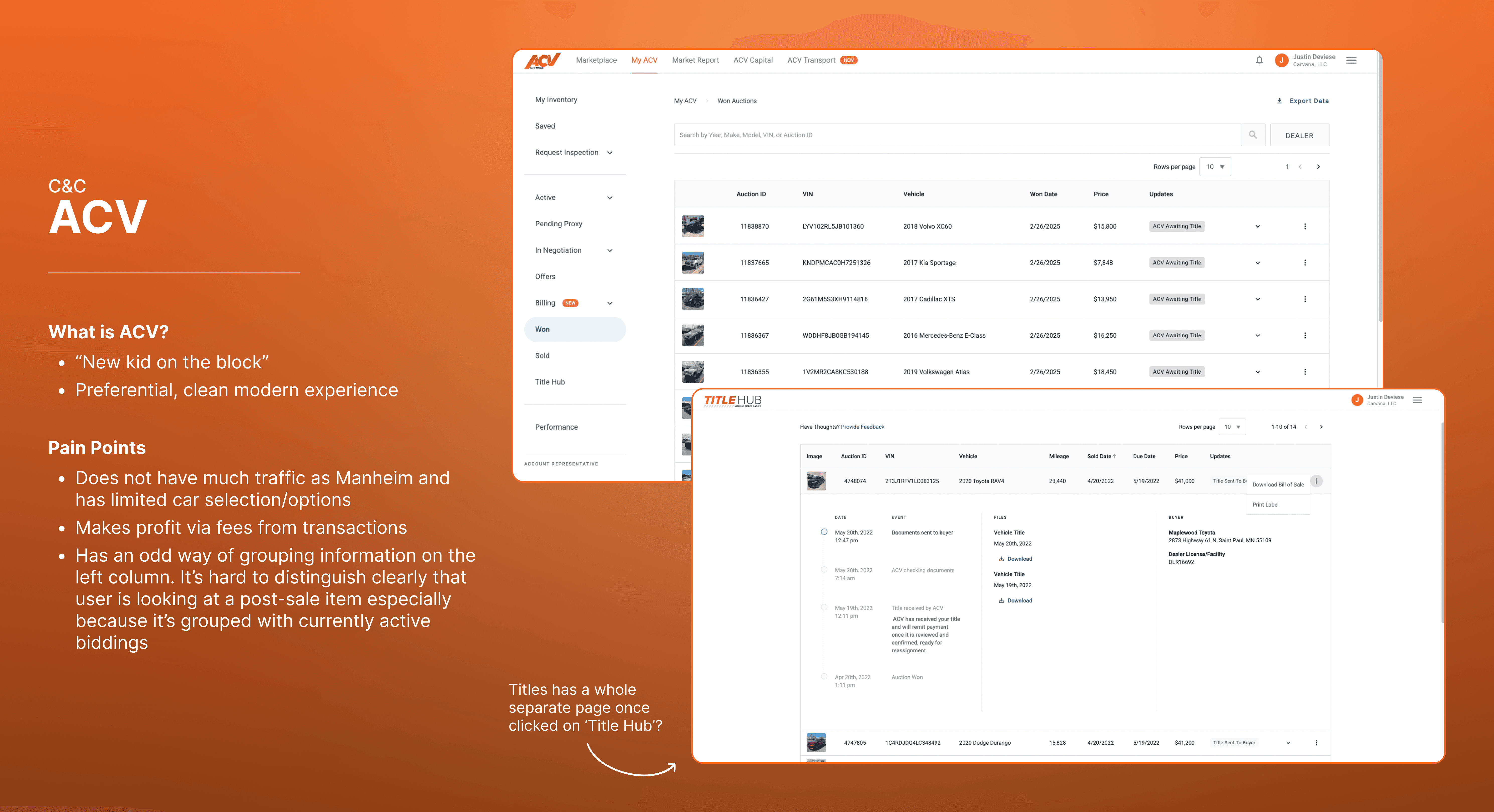
Next, there's ACV. Its real-time, user-friendly interface appeals to modern dealers, making it a formidable competitor in the wholesale auction space.
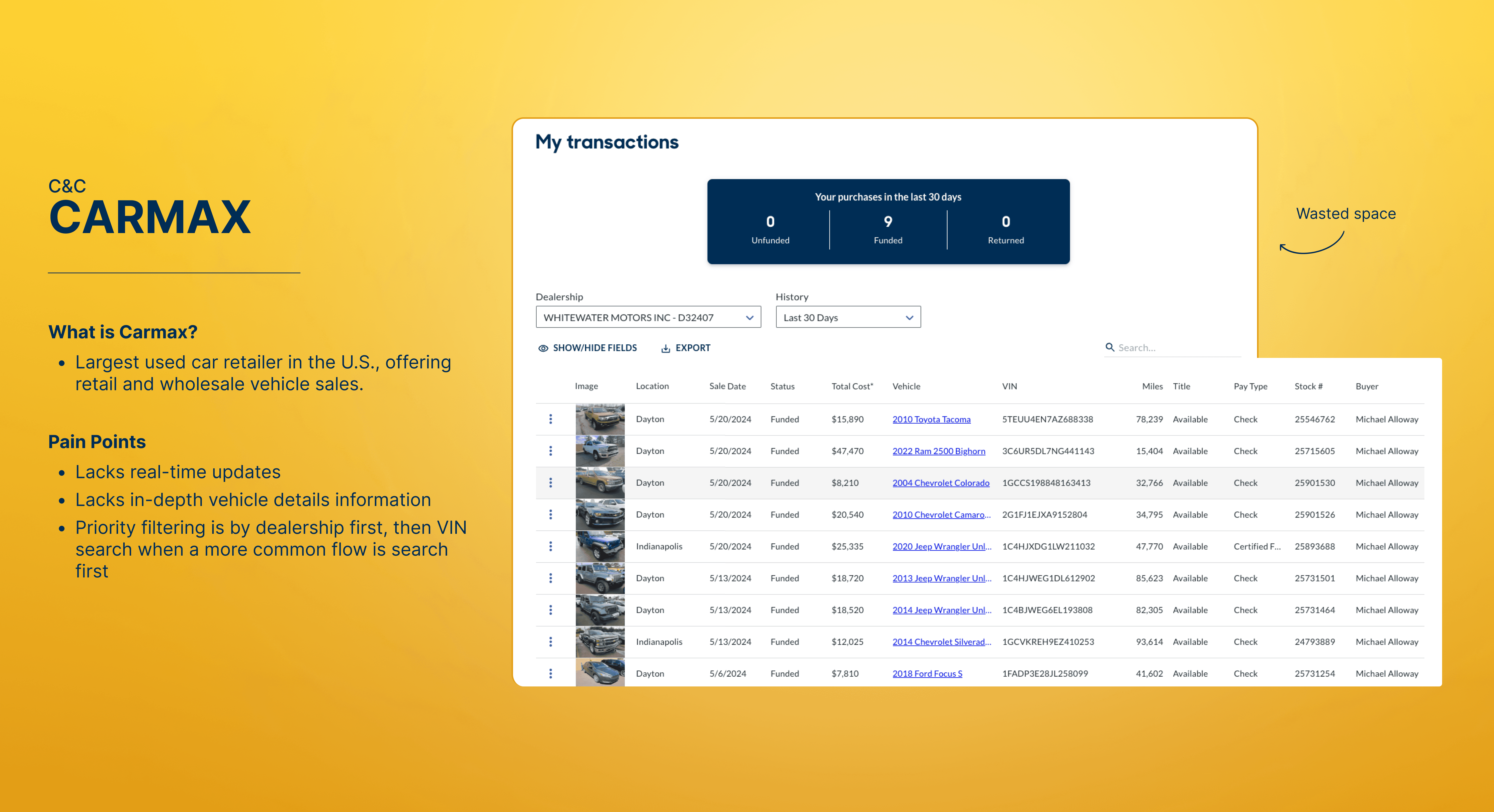
Last but not least Carmax, which is the largest used car retailer in the U.S.
Let's also take a closer look at how Manheim, ACV, and Carmax compares in key areas. Below is a feature analysis that highlights strengths and weaknesses of the 3 platforms.
The rows where its all 'yes's are features that are a must need. The rows where its 3 'yes's are nice to haves.
V. What's wrong with Adesa's current purchases experience?

There's a lack of information hierarchy, and it's hard to tell what piece of information is most important.
All 'Open Order's should be ready to checkout.
Infinite scroll is better suited for the exploration of content, where users are browsing aimlessly for something interesting. However for Purchases, users have a clear goal of checking out the vehicles they've won. Therefore, infinite scrolling is unnecessary here.
What's the purpose of this page? What should the user's behavior be? The layout of this page makes it seem like the purpose of this page is to intake a lot of information rather than select vehicles for checkout. Why not group the behavior in two parts?:
Part 1 - User selects vehicles by only seeing high level information
Part 2 - User has the option to see more in detail about the vehicle(s) that will be checked out.
Unnecessary tabs to group information.
VI. Happy Flow
This is a high-level happy flow that users will go through from the Purchases dashboard to the start of Checkout flow. We tried to make the experience as straightforward as possible.
VII. Web Explorations
A key factor in creating a successful page is exploring all available options within the given scope of time. I kept the feature analysis I did in mind while iterating.

VIII. Touchpoints
Throughout all iterations, I've made sure to communicate different versions to my cross functional teams as well as our design system team. After each meeting, I've sent recaps of what was discussed and decisions that were made.
This process was never a linear one, which is why it's a beautiful one. We had lots of conversations going back and forth due to the nature of Adesa Clear being freshly built. I've realized how important it was to communicate using prototypes and later also tried to record myself via Zoom going through the workflow to minimize confusion.
My team! 💙 Most of my Wholesale team are in Arizona's headquarters or in the far far east. I had a blast picking their brains on the wholesale industry to get a deeper understanding.
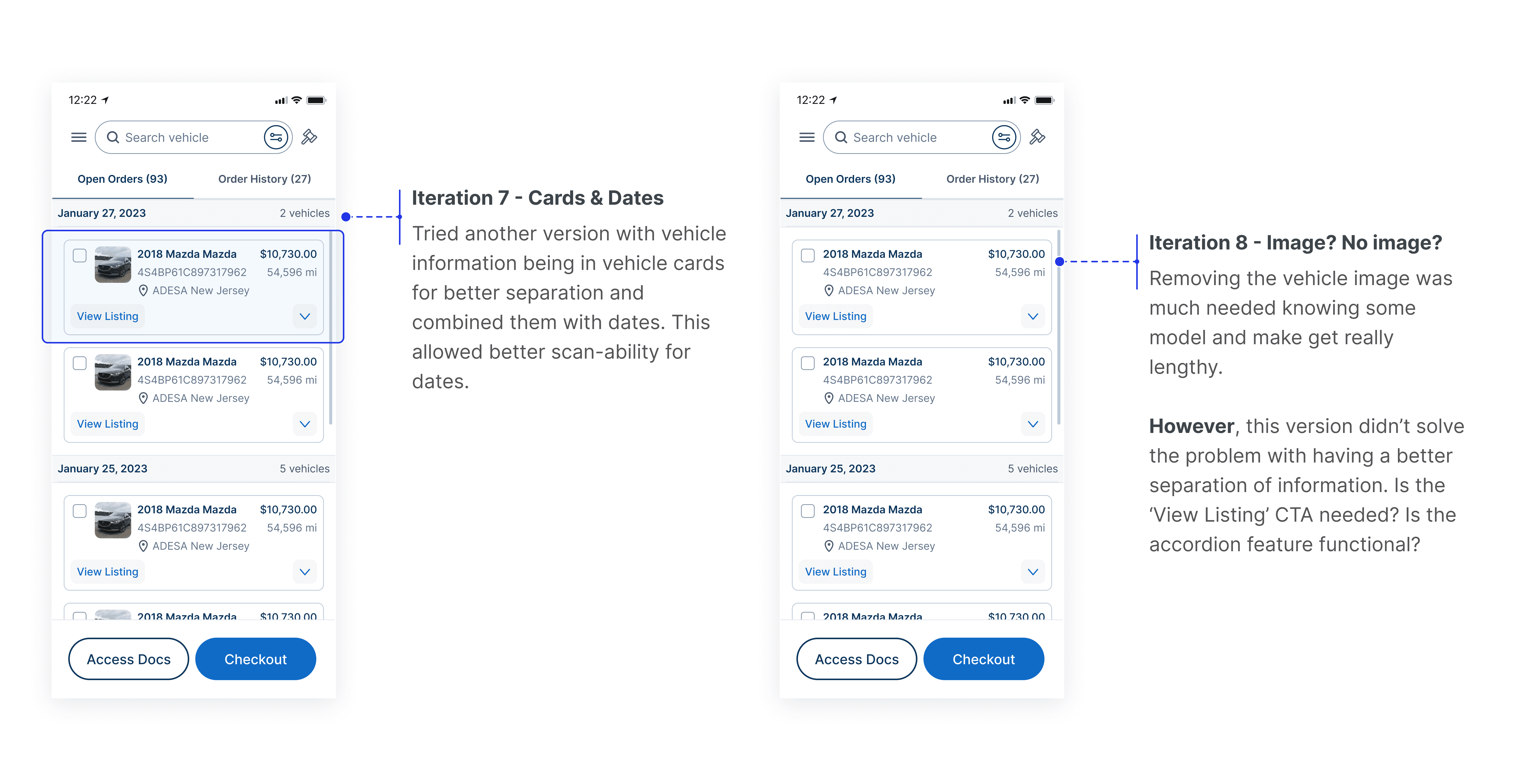
IX. A New Struggle - Mobile Edition
As I was designing for web, I was also designing for mobile. And oh boy…the struggle for mobile was a real one. It was already hard to fit all necessary info on web, how did I find a solution for mobile?
The first step was to make a rough wireframe to lay out my ideas.
I've realized that I was trying to do too much within the first couple iterations so I tried to break it down even further, focusing on chunks of information.
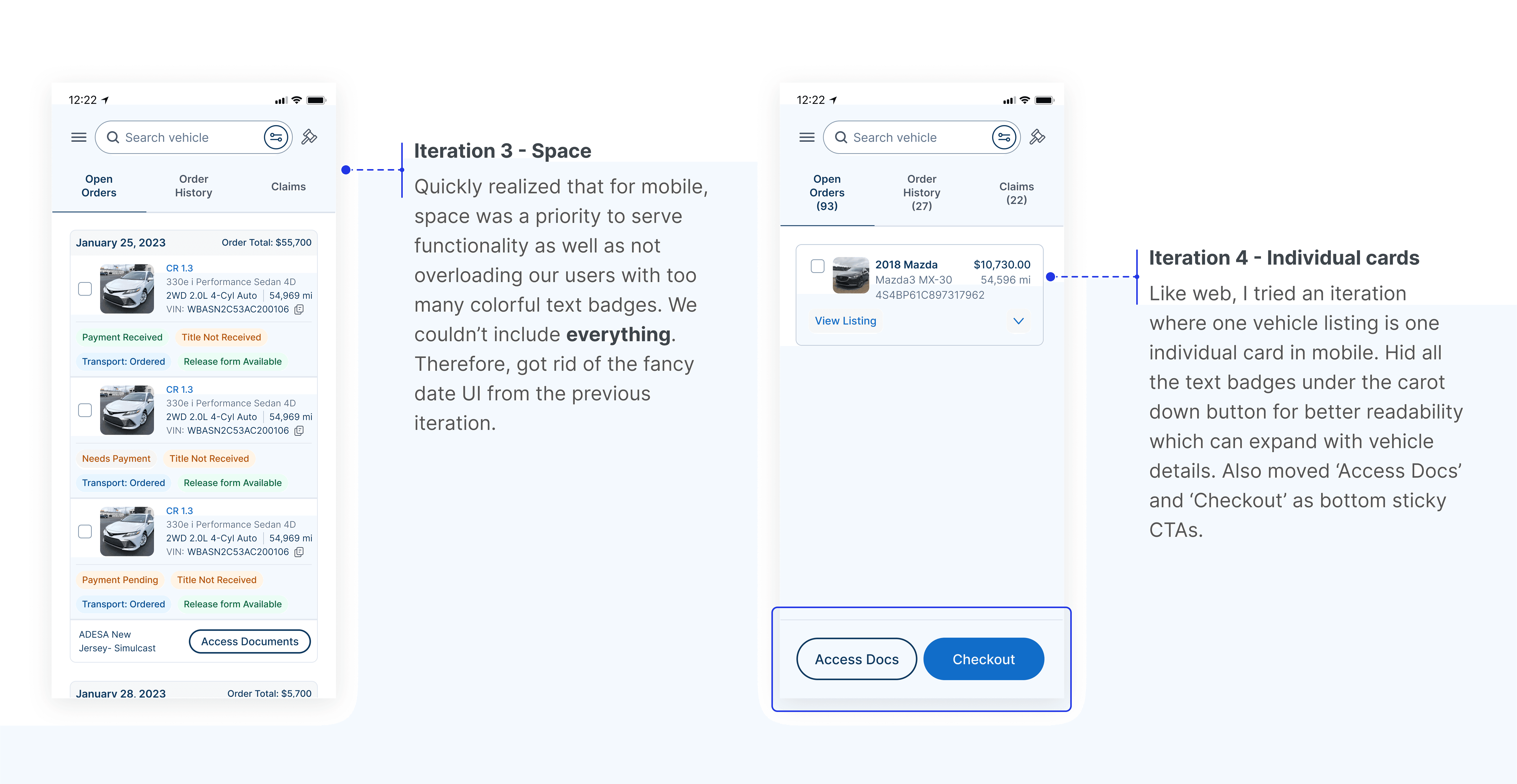
The next two iterations includes efforts of identifying the usage of multiple buttons on a mobile screen as well as playing around with the dimensions of the vehicle image. I've also tried a different layout that doesn't involve putting information in a vehicle card.
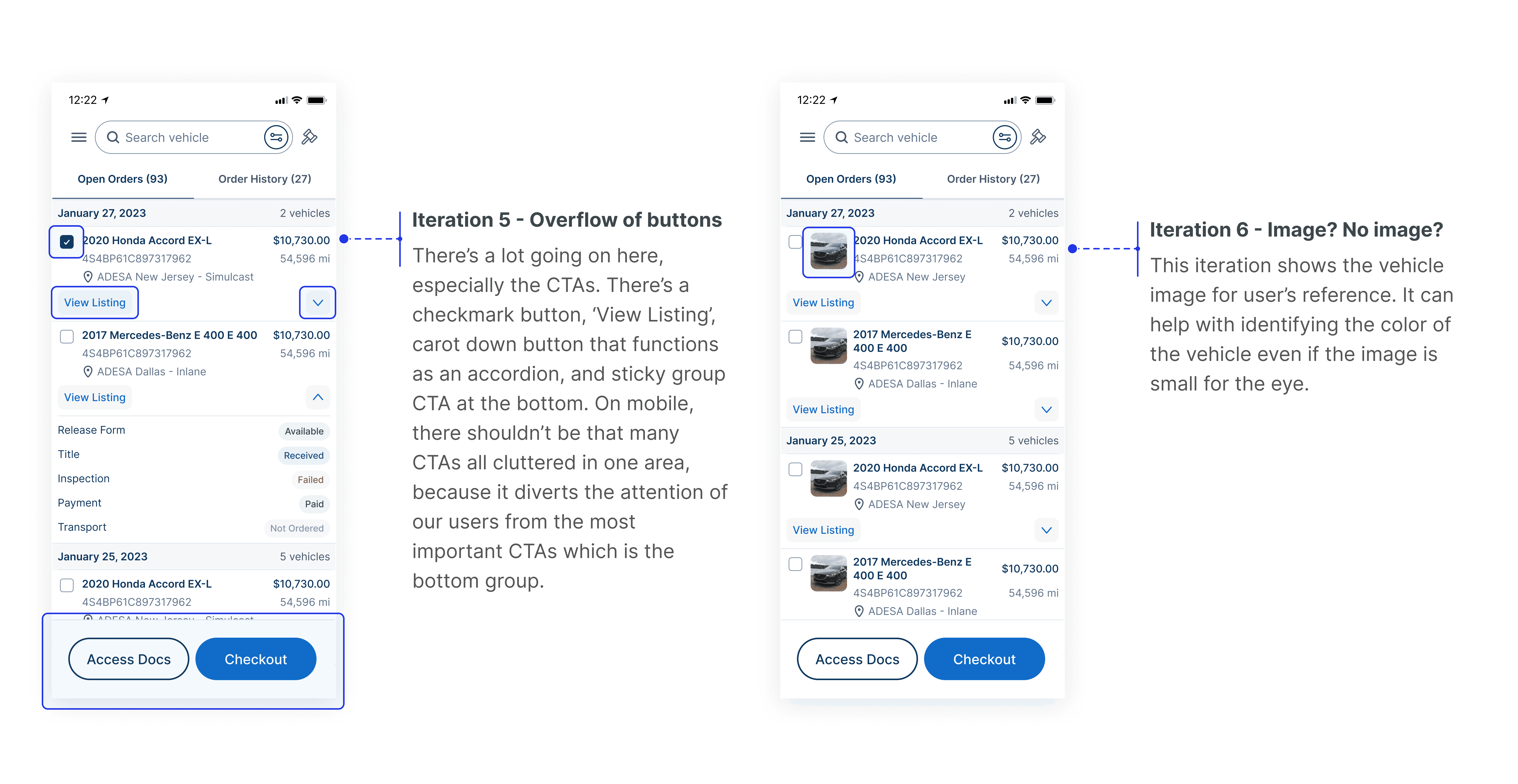
After some time it seemed like the iterations were headed on the right direction, where it became more parallel with web designs.
⚠️ A common problem I faced for web and mobile was not knowing where to place the vehicle details information along with the rest of the purchases content that users find more important. There needed to be a solution where both information can live without disrupting the user flow.
💡 This led to important design questions:
How can I guide users through dense, necessary information without overwhelming them?
How can I show everything they need — but in a way that feels simple and intuitive?
Is it possible to present all information while making it feel less heavy?
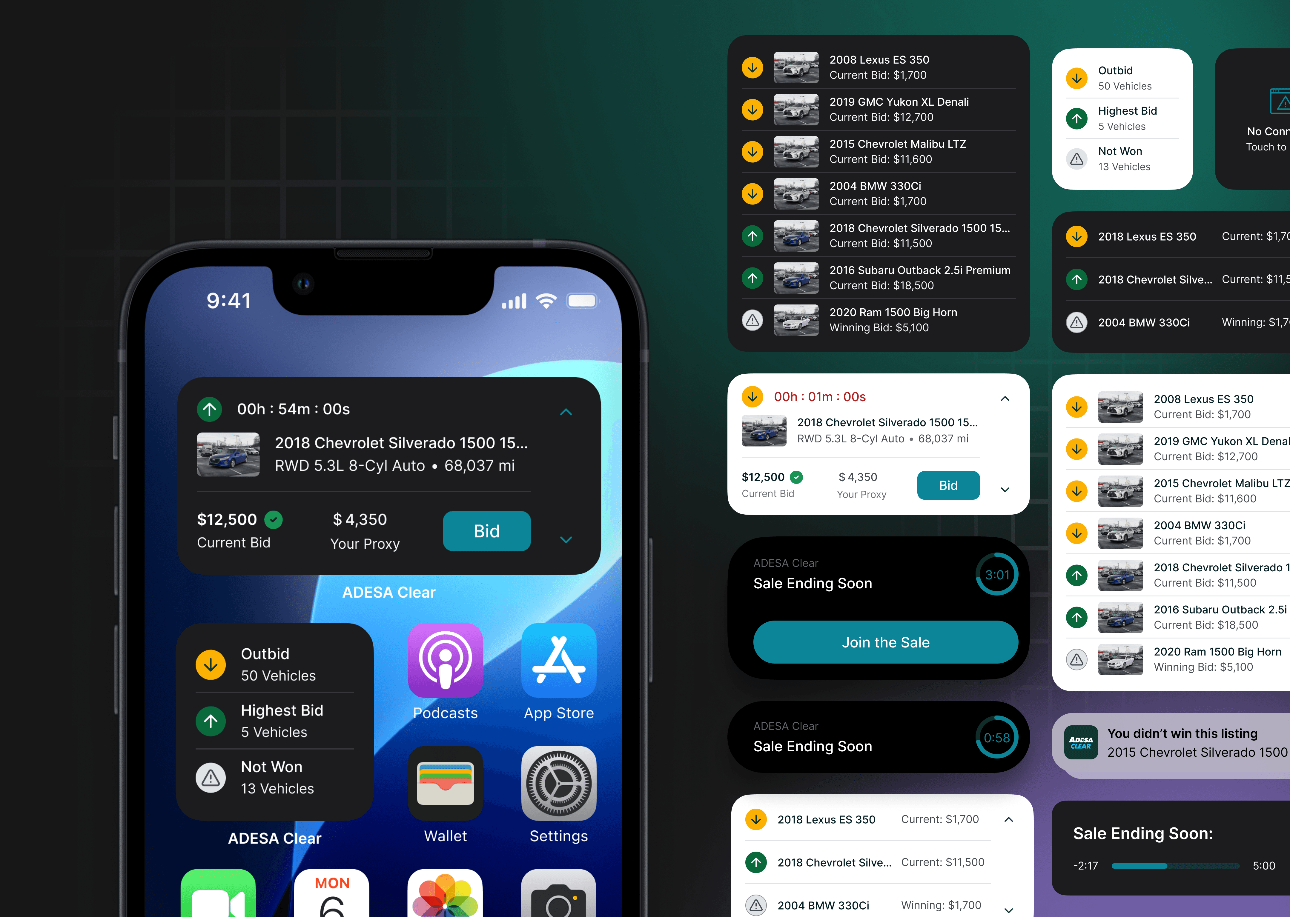
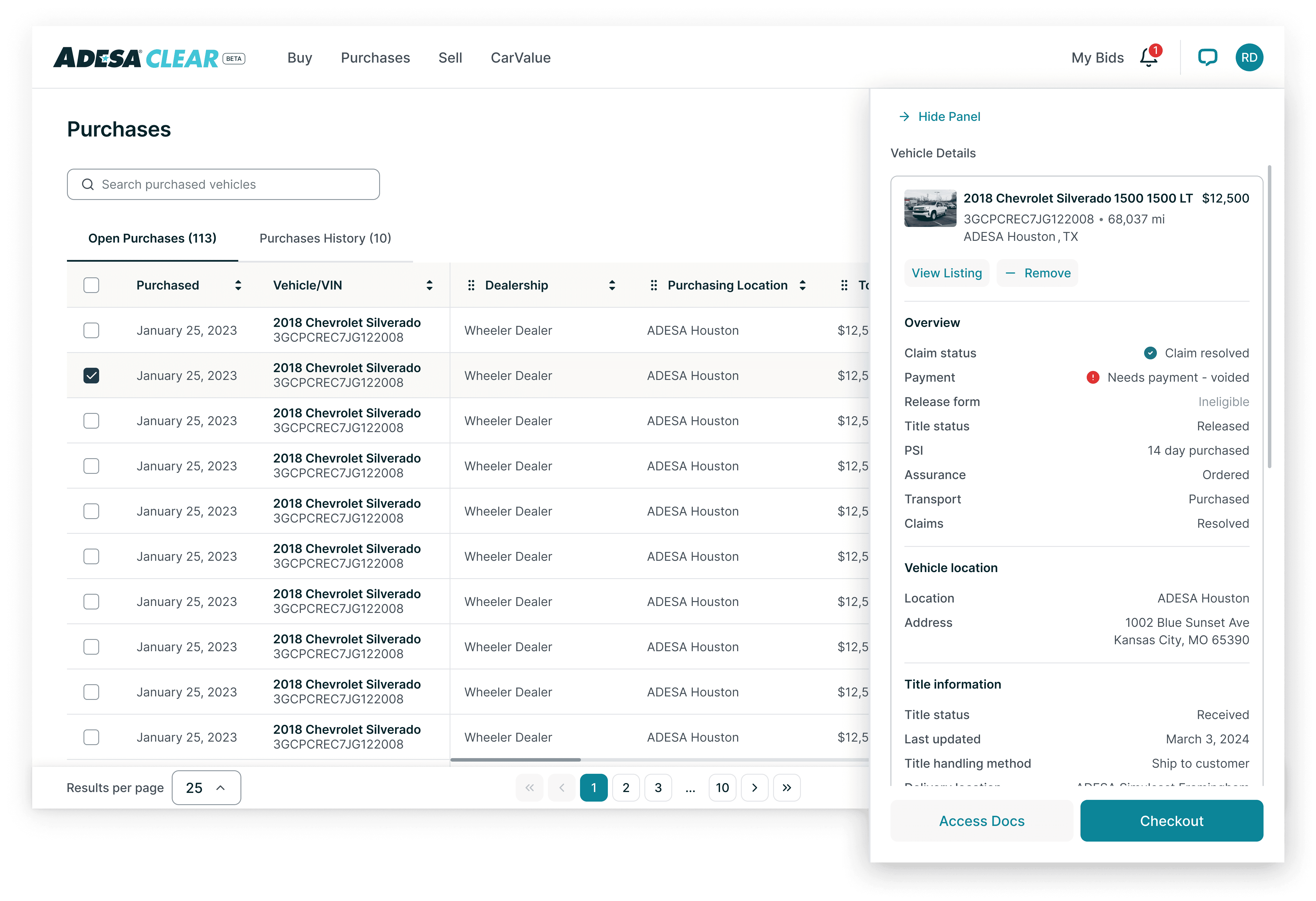
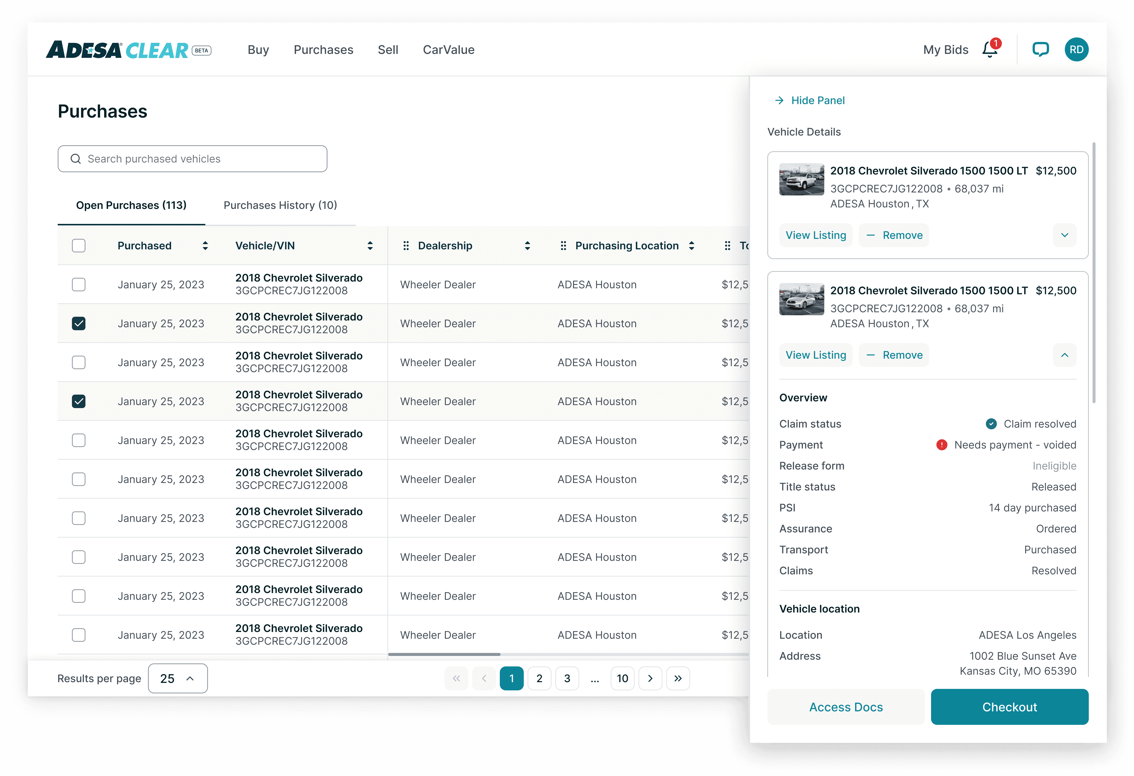
X. Solution - Panels and Sheets
To address the challenge of effectively displaying vehicle overview information alongside the purchases content without disrupting the user flow, the solution leverages panels for the web and sheets for mobile. This approach maximizes space for the information that matters most to our users — in this case, allowing users to view as many key details (vehicle VIN, purchased date, dealership, total amount, payment status, etc.) about the vehicle possible per page.
On web, vehicle details will be presented in a collapsible or expandable panel from the right side, ensuring it is easily accessible while maintaining focus on the primary content. From here, user can 'Hide Panel' or keep selecting more vehicles for bulk checkout. The layout has flattened out significantly from the first wireframes enabling better prioritization of information.
(Side note: DSL has been updated since the last web iteration)
User is able to horizontally scroll within the table which will have 'Purchased' and 'Vehicle/VIN' pinned, since those two columns are primary information. To the right of the table, user can move the columns around to their liking. If the user wants to see vehicle details of selected item, then clicking 'Show Panel' will reopen the side panel from the right.
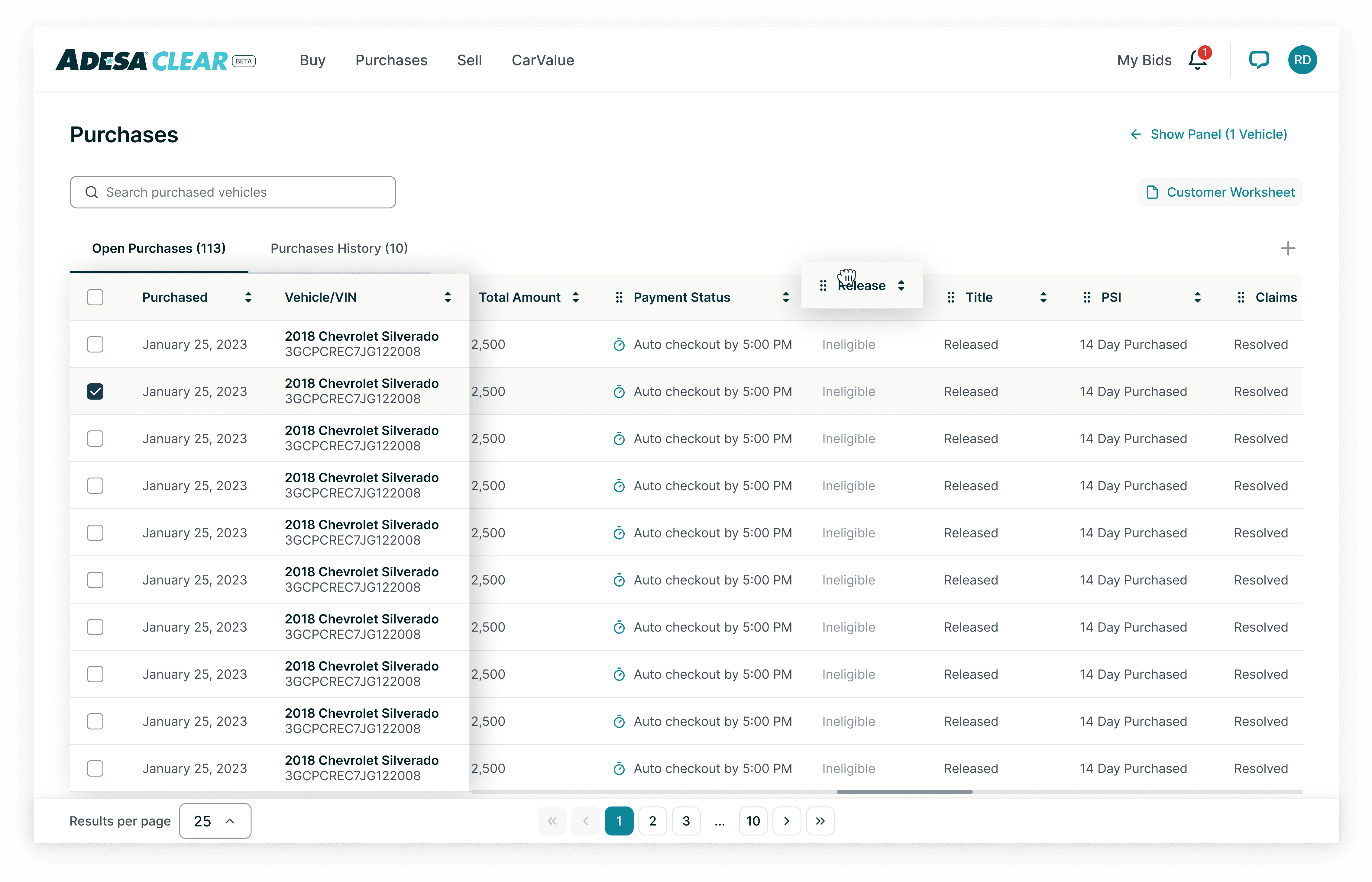
With more than one item selected, there will be one change to the vehicle cards in the right panel. There will be an accordion feature, allowing the user to freely expand or collapse vehicle detail information. This feature is necessary because with bulk purchases, it allows autonomy over which vehicle details users wish to see.
On mobile, I utilized bottom sheets that pull-up from the bottom of the screen for users to access vehicle details without overwhelming the screen or interrupting their interaction with the purchases content.
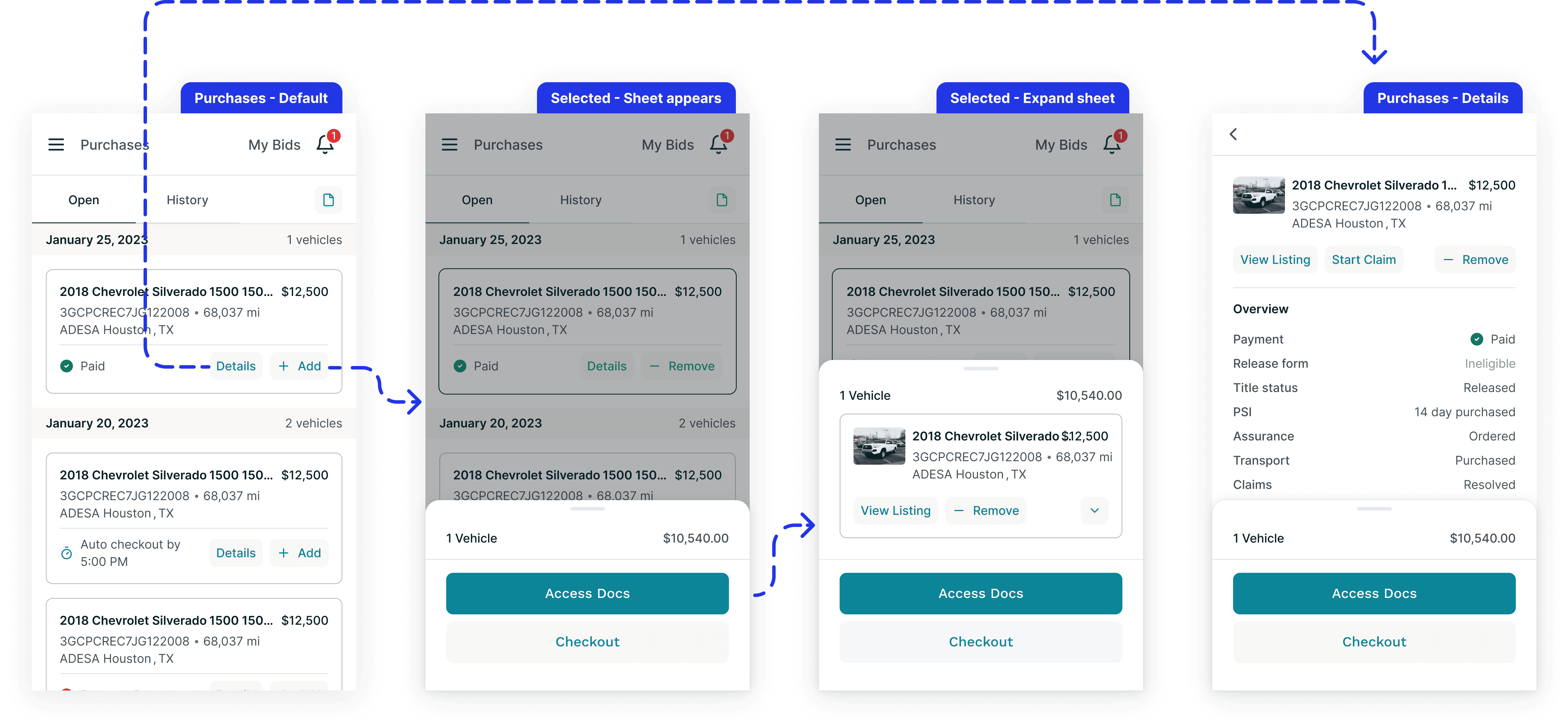
When '+ Add' is selected, a button group and sheet will appear. It can be expanded for users to see what's been selected and ready to purchase. This is helpful for users who are deep in their scroll, as it allows them to maintain their place while keeping their selections fresh in their minds.
'Details' will lead the user to the last screen shown above, which shows the overview, vehicle location, title information, purchase details, fee details, claim details, and claim history of a vehicle.
XI. Final MVP Product
Note: The prototypes below are only showing high level happy path flow. If interested in flows that involve other states, please don't hesitate to reach out!
Web single checkout - Selecting a vehicle will automatically open the side panel with vehicle details open by default

Web bulk checkout - Adding a second vehicle will collapse the cards

Mobile - The pull up sheet parallels the side panel on web, and 'Details' lead to a full page view of vehicle details

XII. Current Results
XIII. However…
The Purchases experience still needs improvement because right now the experience is mediocre. We are receiving > 2 support interactions per sale and > 50% goes to voicemail. To address this issue, we added additional features on Purchases to give our users more clarity around our experience. You can find the case study here.
🌟 This was one of the most rewarding projects as a designer
Close but also frequent collaboration with PMs and ENGs was the key to successfully executing Purchases. As a junior product with only six months at Carvana when starting this project, I couldn't have managed the complexity of this project without the support of my cross-functional team.
In hindsight if there was an ample amount of time, I would have suggested conducting user interviews with dealers using buy.adesa.com to gather more targeted insights, rather than relying solely on competitor analysis. This approach would've been more effective, as dealers often seek specific details in their Purchases dashboard before moving to Checkout.
Don't settle for just one version! Explore multiple options and think creatively within the project's scope. This approach helped me develop a framework that works best for Purchases by focusing on organizing large amounts of information effectively.