🚀 Impact - To address rising support interactions, we redesigned the Purchases page with added features that improved access to key post-sale actions, leading to less user confusion and a noticeable decrease in support dependency.
Date
05/2024 - 06/2024
Role
1 of 2 Product Designers - planning, research, execution
Team
1 PM, NaN ENG Team, 2 Product Designers
Current Problem
Currently with 15K+ accounts, linked in Adesa Clear, Purchases is receiving > 2 support interactions per sale while > 50% goes to voicemail.
Business Problem
The Purchases page on ADESA Clear is underperforming, generating over two support interactions per sale, with more than 50% going to voicemail. This inefficiency increases operational costs and creates friction in the sales process, impacting overall customer satisfaction and retention.
User Problem
The current Purchases experience lacks clarity, leading to confusion and frequent support requests. Users struggle to find the information they need, resulting in a disjointed and frustrating post-sale process that requires further improvements to streamline and enhance usability.
HMW
How might we provide the clarity and usability of the Purchases page to reduce support interactions and create a seamless, frustration-free, post-sale experience for users?
Success Metrics
Reduce the number of support calls from 55% to 25%.
Design Goals
Leverage existing Helios library (the new design system library) to create a unified look and feel by applying consistent design patterns across all screens.
Provide clarity and transparency by surfacing key information upfront so users always know what to expect.
Have consistent component usage across all screens to create a predictable and intuitive experience for users.
Currently on our Purchases page,
There’s no functionality to filter the dashboard.
There's no functionality to filter dashboard by date range.
The inability to search for multiple vehicles at once became a major hurdle for bulk-purchasing dealers trying to locate specific inventory.
Questions we had while designing
🤔 Question #1: Filter panel consistency - Should we apply the same 'Search Result Page' filter behavior to the 'Purchases' page?
Why SRP's filter behavior works:
There are two parts: (1) Anchored Left Rail – This is a fixed filter on the left side. (2) Slide-Out Filters Panel – This panel slides out from the left after a filter is selected.
This setup works well because there are a lot of filter options. Splitting them into a fixed left rail and a slide-out panel helps make it easier and faster for our dealers to find and choose the filters they need.
Best practice for transparency:
User can see which filters are chosen on the anchored left rail as they choose from the slide out filter panel.
It’s not only transparent, but also very efficient.
After analyzing filter behavior on the SRP we considered applying the same pattern to Purchases, weighing its pros and cons. We concluded that Purchases required a different approach since its filtering options are inherently limited (and will stay that way), unlike the SRP.
Filtering on Purchases vs. SRP:
The Purchases page focuses on showing as many vehicles as possible in a dashboard view, making it easy for users to select and add to checkout.
A fixed filter panel isn’t needed like the SRP since the inventory is smaller and filtering options are limited and likely will stay that way.
One too many steps:
Therefore if we apply the same SRP filtering behavior with left and right carot buttons to Purchases, we are dealing with unnecessary clicks.
From clicking ‘Filters’ to ‘X’ing out from filters takes 5 clicks. Also the user needs to go back and forth within the filter panel.
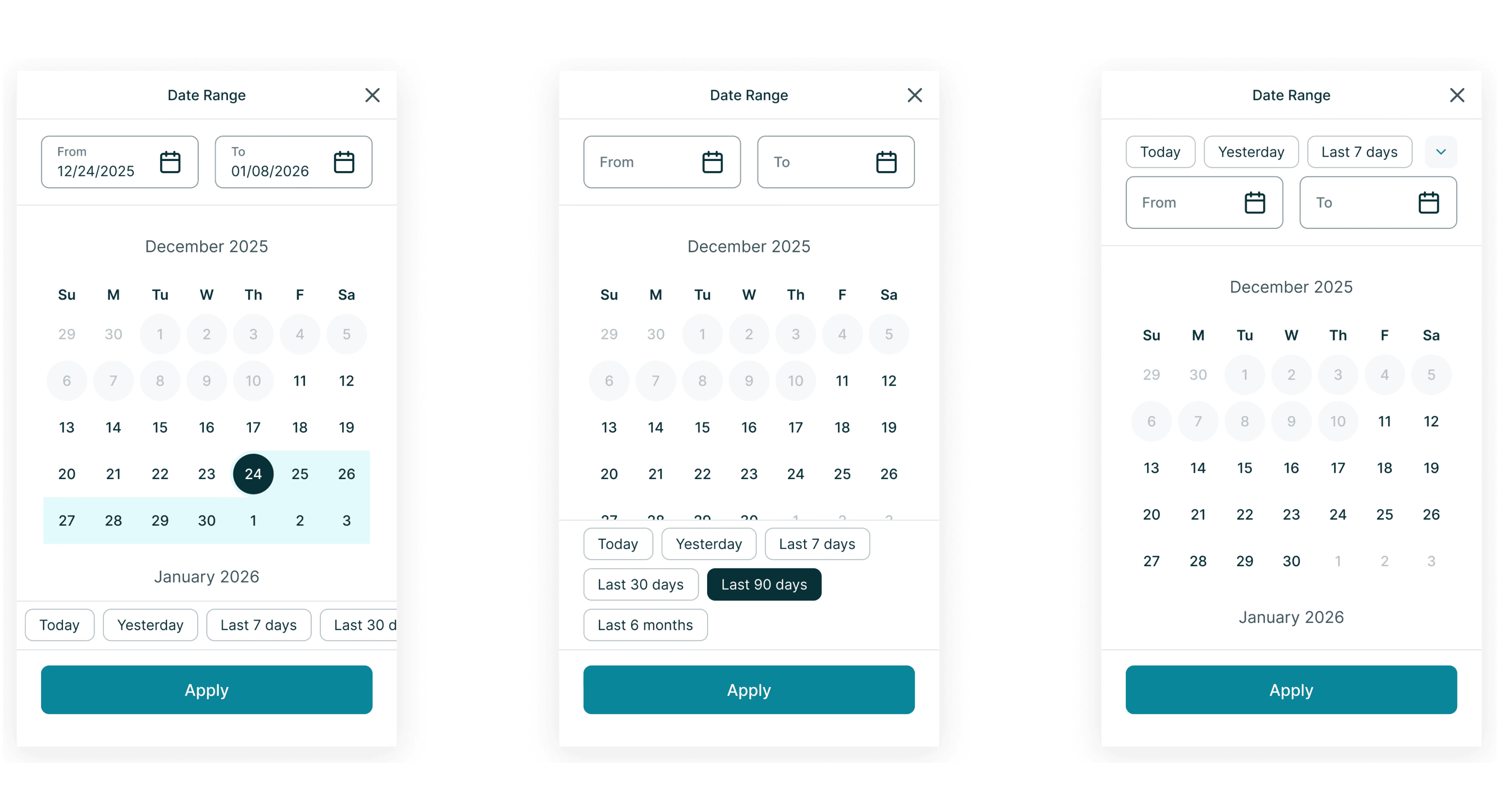
🤔 Question #2: Where is the best place for date selection? Is it inside the filter panel or should it live elsewhere?
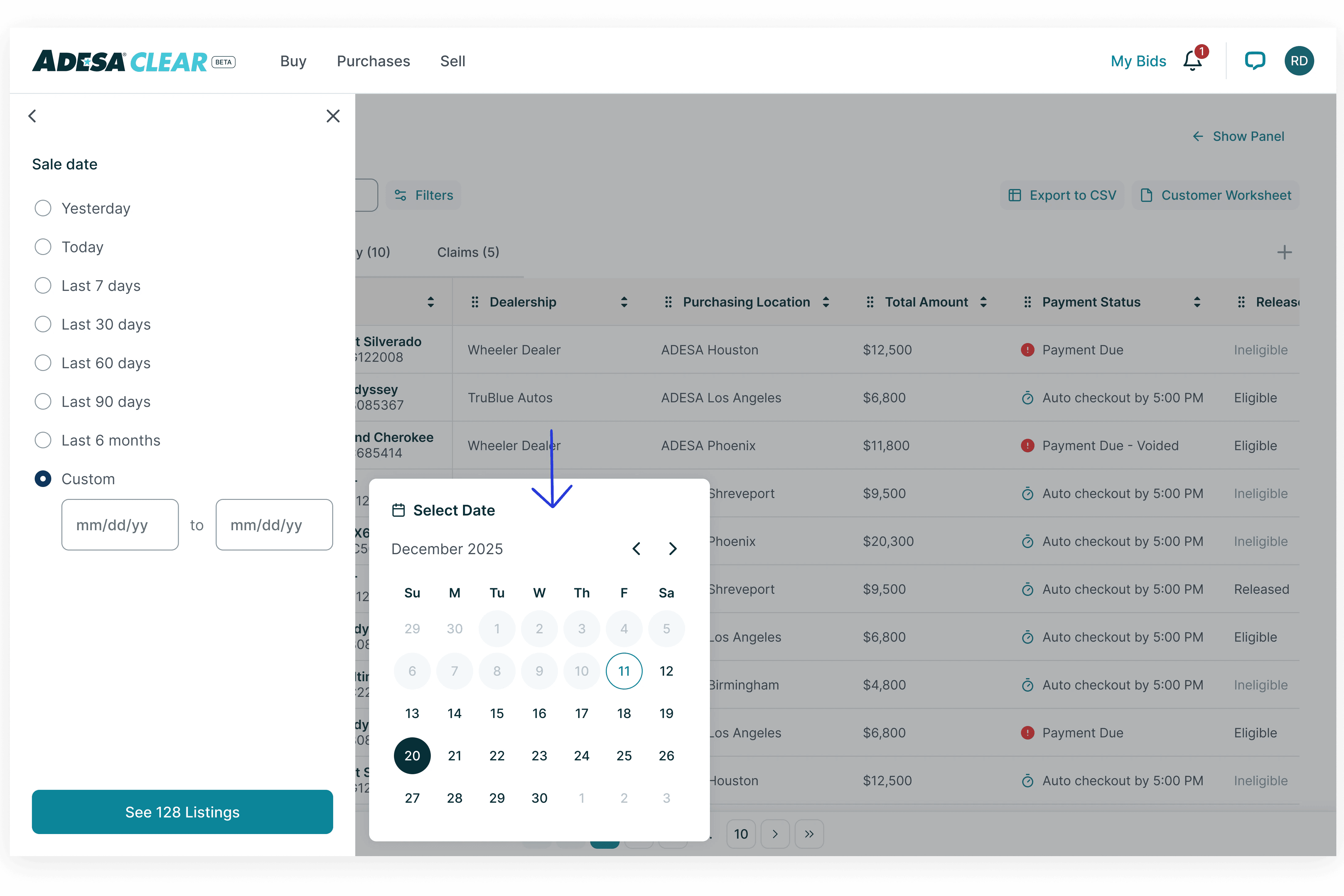
Inside or outside?:
At first, we thought it would make sense for date range selection to be inside the filter panel because it is a filter option just like the others.
However, it didn’t make sense to hide it, as dealers rely on it to view open purchases, history, and claims and would want a one-click solve.
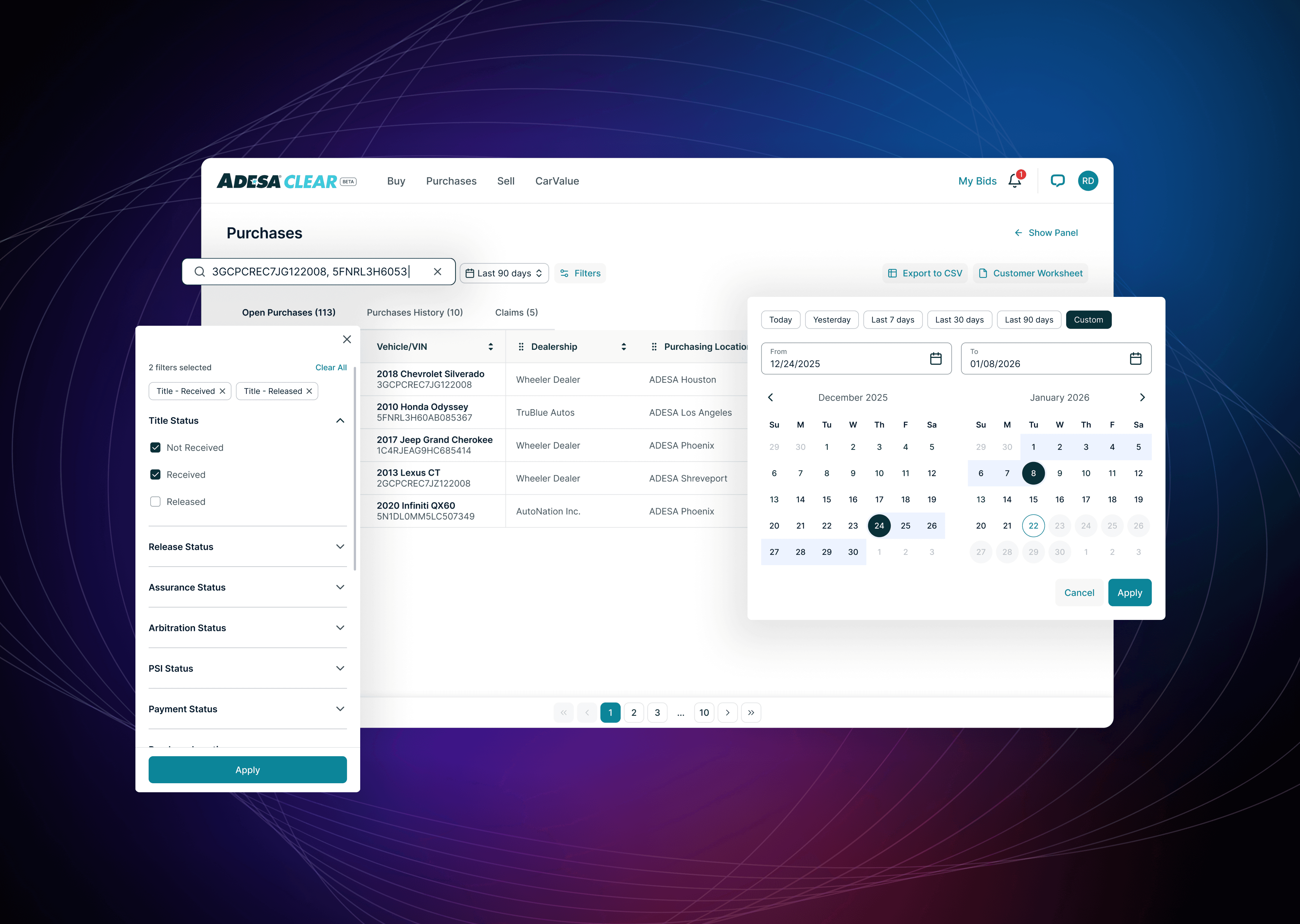
We made sale date selection a standalone filter outside the panel, as dealers frequently use it and prefer a one-click solution over multiple steps.
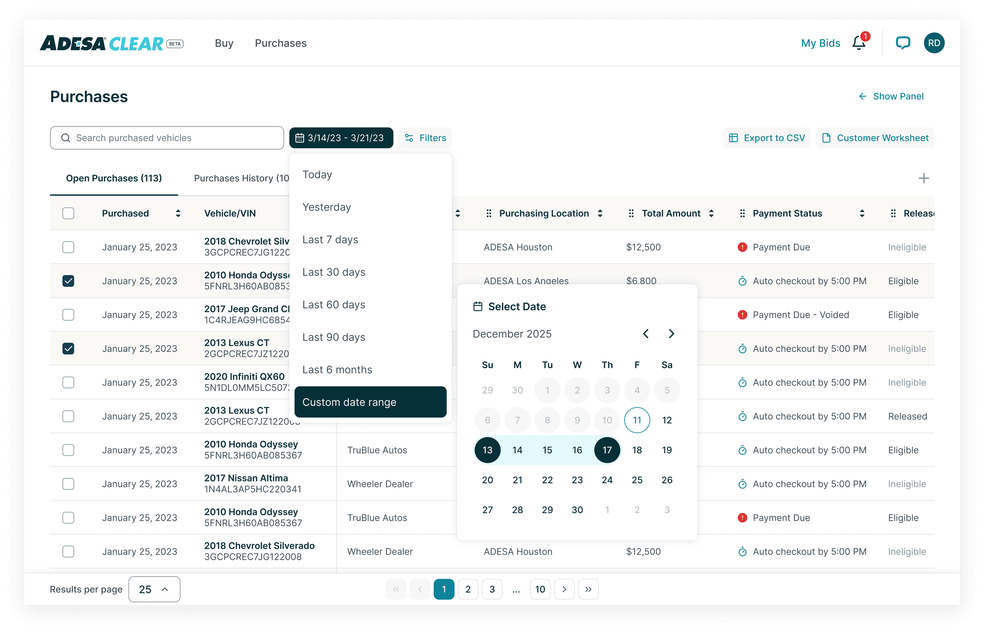
Here are some explorations we did for date selection for web and mobile. We realized that our iterations for date selection was visually too overbearing for our users.
🤔 Question #3: How can we make our designs feel less overwhelming?
Below are some iterations I've done with this question in mind for both web and mobile.


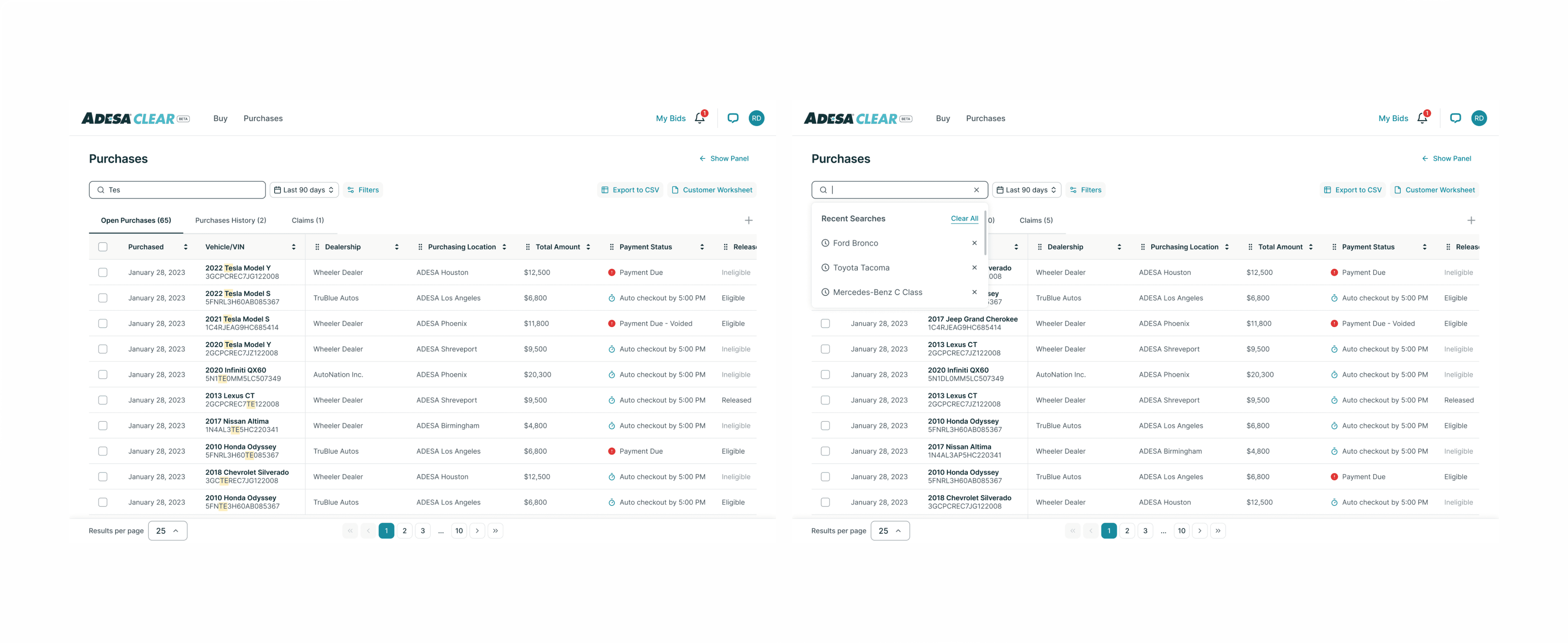
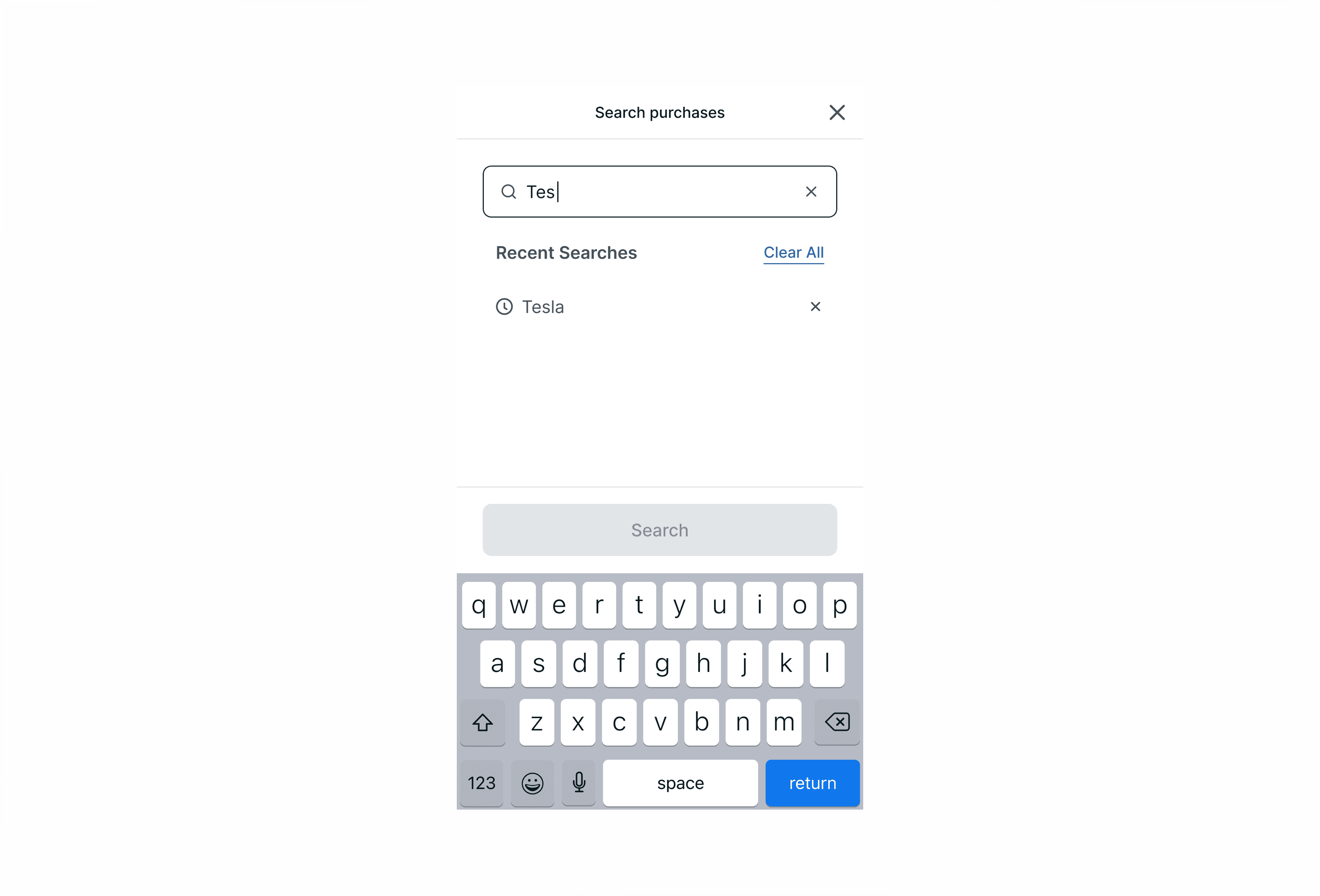
🤔 Question #4: How can we help users find and evaluate vehicles most efficiently with the simplest approach? Would having a search button on web help or is this visually too distracting? Is the search easy to find on mobile?
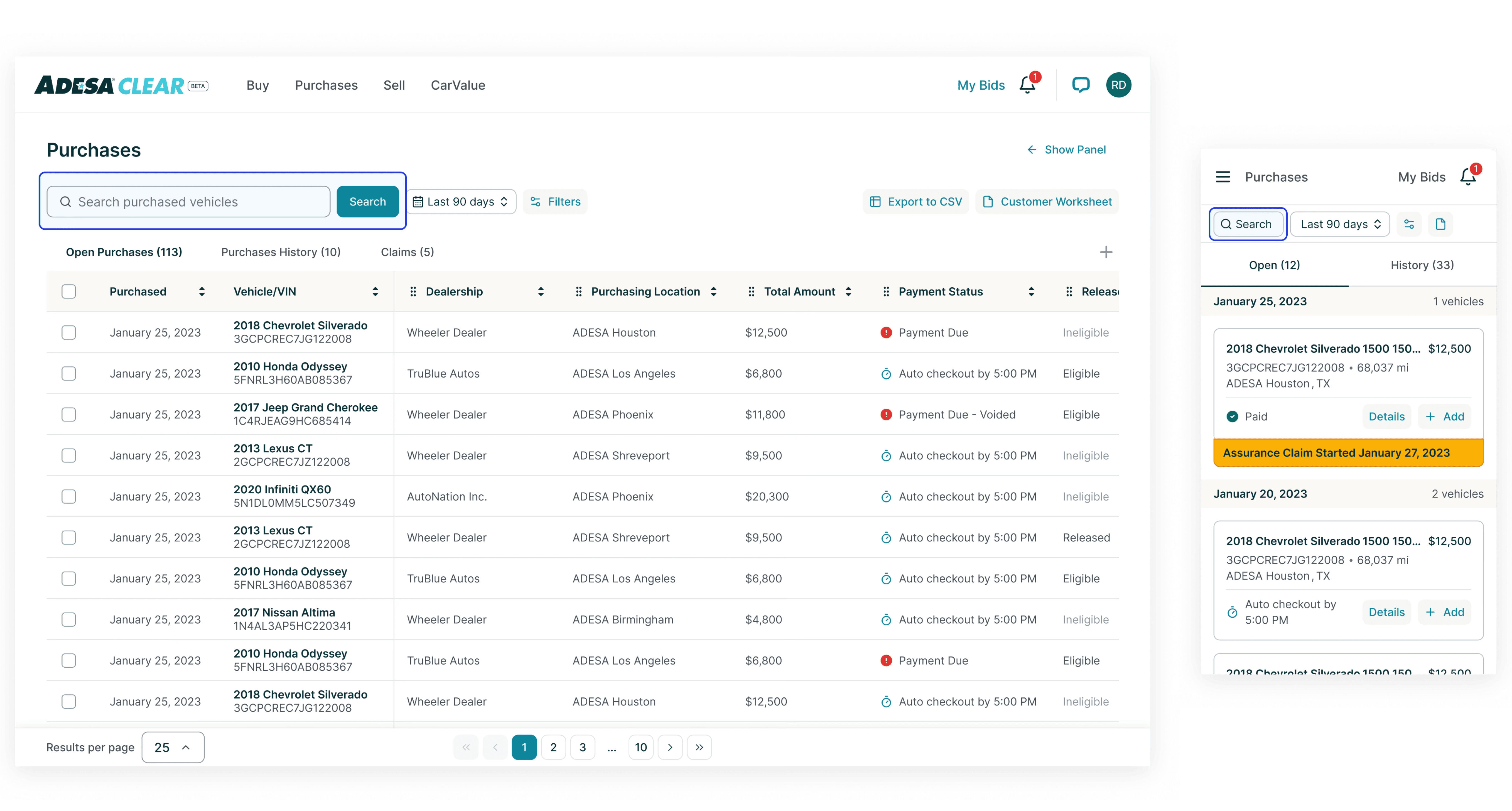
The Solve
Here are the solutions we came up with for both web and mobile:
Filters - Keeping it simple, we decided to have all interactions stay in the same filters panel. Down chevron icon will be used to expand the content and clicking on 'Apply' will apply all filters to the dashboard.
Sale date range - Since selecting a custom date range is less common, we decided to only display full date options when 'Custom' is selected. This approach reduces visual clutter for our users.
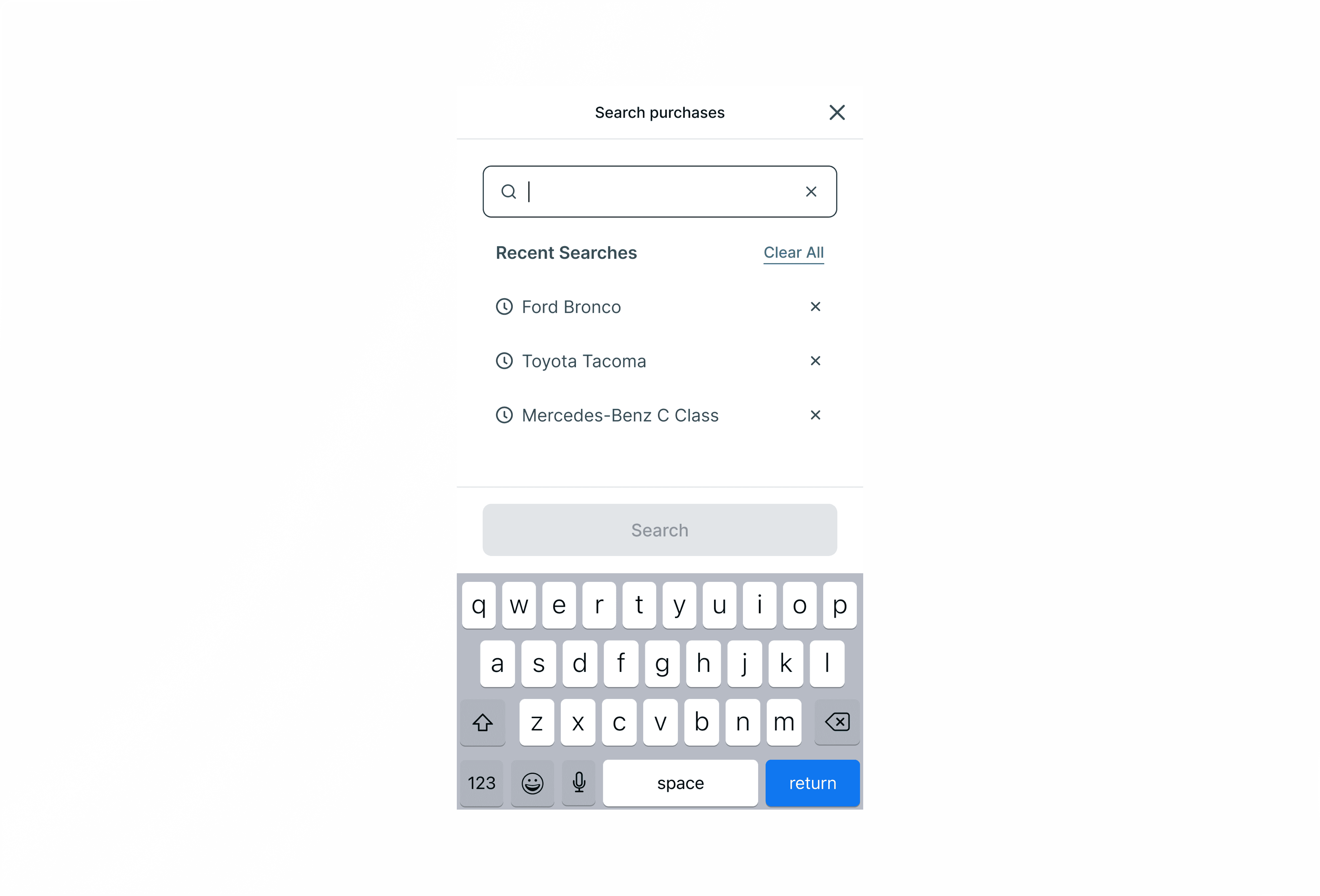
Search interaction - Search applies to all tabs so as a user types, we should remove any purchases in the table that don't match the search query.
Users can search by:VIN. Check if the string matches either the beginning or the end of any VIN. For bulk VIN search user can use commas to separate.
Vehicle information (Y/M/M/T)
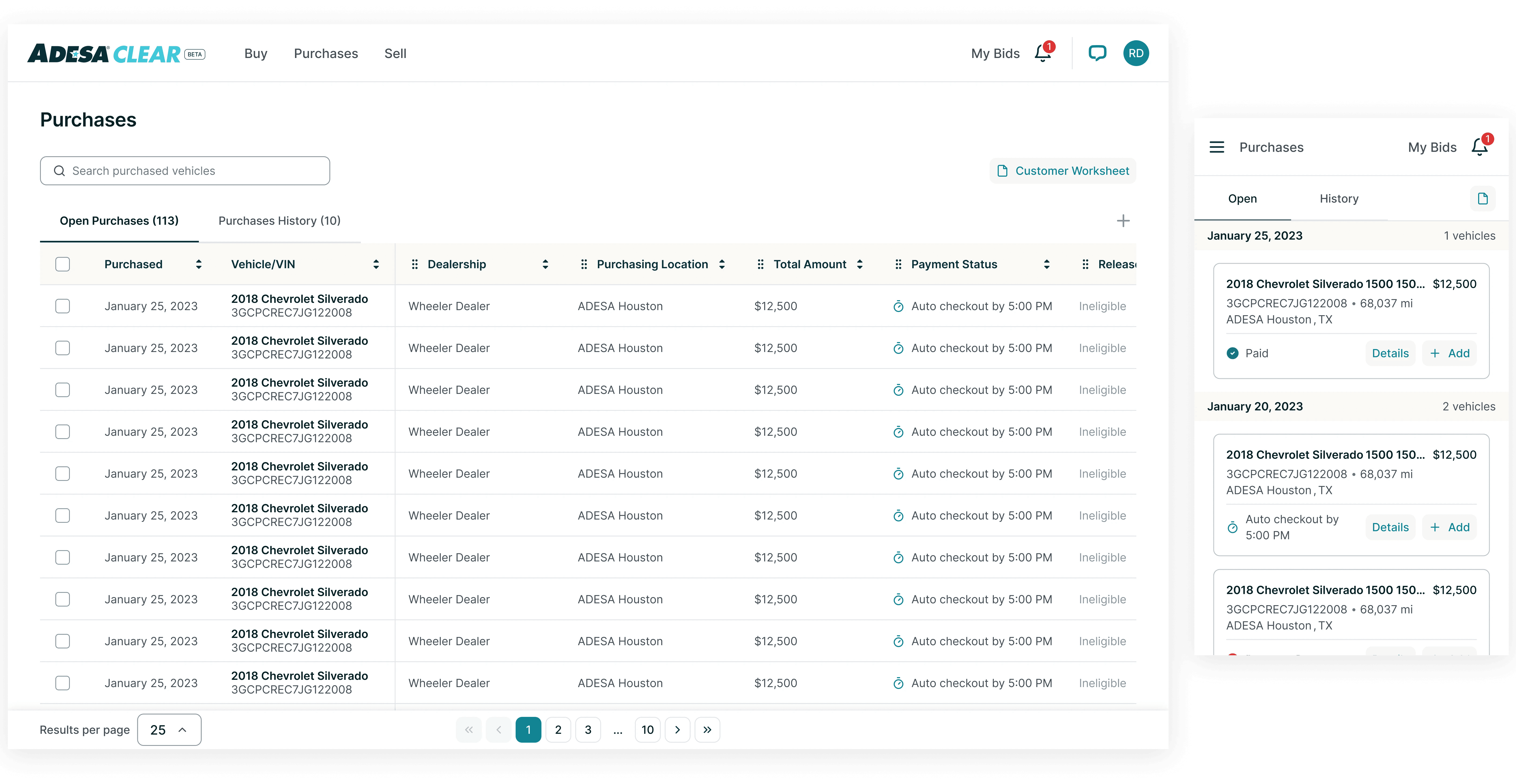
Future State
Reflections
I prioritized exploring multiple design versions and avoided limiting myself to a single approach. This openness to experimentation accelerated the decision-making process, as we were able to evaluate a wide range of possibilities early on. By testing different solutions, we quickly identified the most effective options, streamlining the project and ensuring that we addressed potential challenges from multiple angles.