🚀 Impact - As the first auction platform to roll out bidding features, we set the standard for real-time competitive engagement in wholesale car sales.
Date
06/2024 (2 week sprint)
Role
Sole Product Designer - planning , research, execution
Team
1 PM, 1 ENG Lead, NaN ENG Team, me
Business Problem
Adesa Clear's mobile app lacks advanced features that could enhance user engagement and bidding efficiency, limiting its competitiveness in the digital auction market. Without innovations like interactive features on a lock screen and embedded system widgets, the app risks losing traction to more agile competitors in the potential future offering quicker and more interactive experiences.
User Problem
Users find the current mobile app less convenient for real-time bidding, as they must open the app to see or place bids. This adds unnecessary friction, reducing the overall ease and engagement in the auction process, particularly for frequent bidders who need quicker access.
HMW
How might we incorporate seamless, real-time bidding features for the Adesa Clear mobile experience to enhance user convenience and engagement, allowing customers to bid more efficiently without needing to open the app ?
Measuring Success
30 % increase of bids placed on Adesa Clear:
1. % of returning users who place a bid within 7 days of searching a listing, measured 30 days after features release. 16.6% → 21.58% (+30%)
2. % of new users who place a bid within 7 days of signing up, measured 30 days after this feature releases. 5.3% -> 7.5% (+30%)
What do we know so far?
Here are some data from Mixpanel and internal SQL queries about time-to-bid behavior:
0%
0%
of users place their first bid within 5 min of viewing a vehicle
0%
0%
of first bids happen within business hours on the same day the sale ends
0%
0%
of users place their first bid within 6 hours of viewing
These findings made it clear that our dealers are making decisions under intense time pressure, and every second counts.
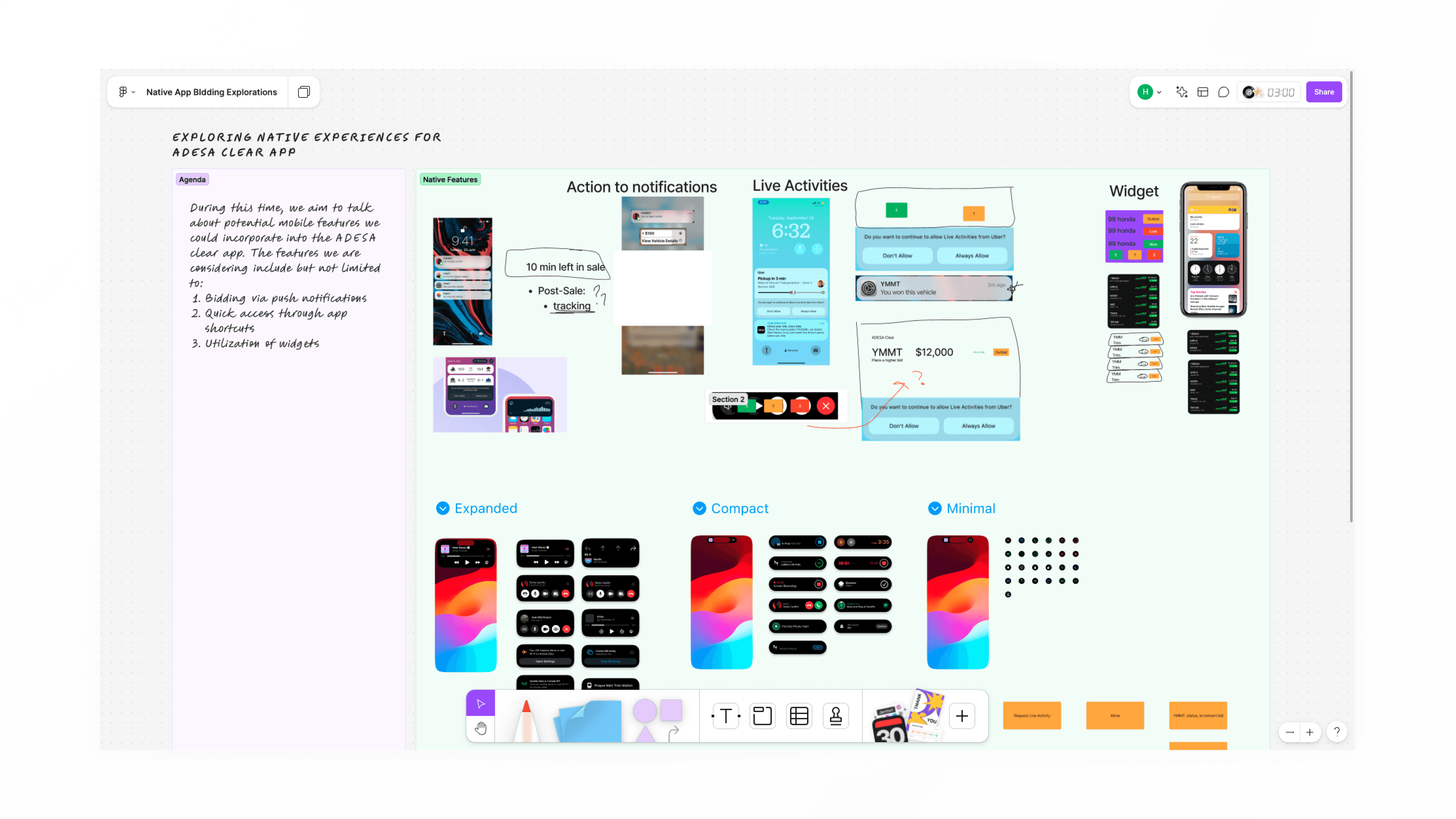
Fostering Alignment
For this project specifically, I led the Figjam session to gain clarity with the project scope. Some questions that arose were:
How many features are we trying to create?
Where does this fall in our list of priorities?
What is the timeline for this project?
Also, what are some ideas we have?
My stakeholders love jam sessions because it exercises a part of their brain that they don't use on a day to day (the creative & artsy side) and we always have a blast!
Area of Opportunity
The key opportunity for enhancing the bidding experience lies immediately after a user has placed a hard or proxy bid or after they have successfully won a bid. This is a critical moment where users are actively engaged and highly attentive.
Designing thoughtful interactions at this stage such as clear bid confirmations, real-time updates, and post-bid guidance can reinforce trust, reduce uncertainty, and encourage continued participation.
Additionally, surfacing next steps or relevant vehicle actions can help maintain momentum and improve overall platform retention.
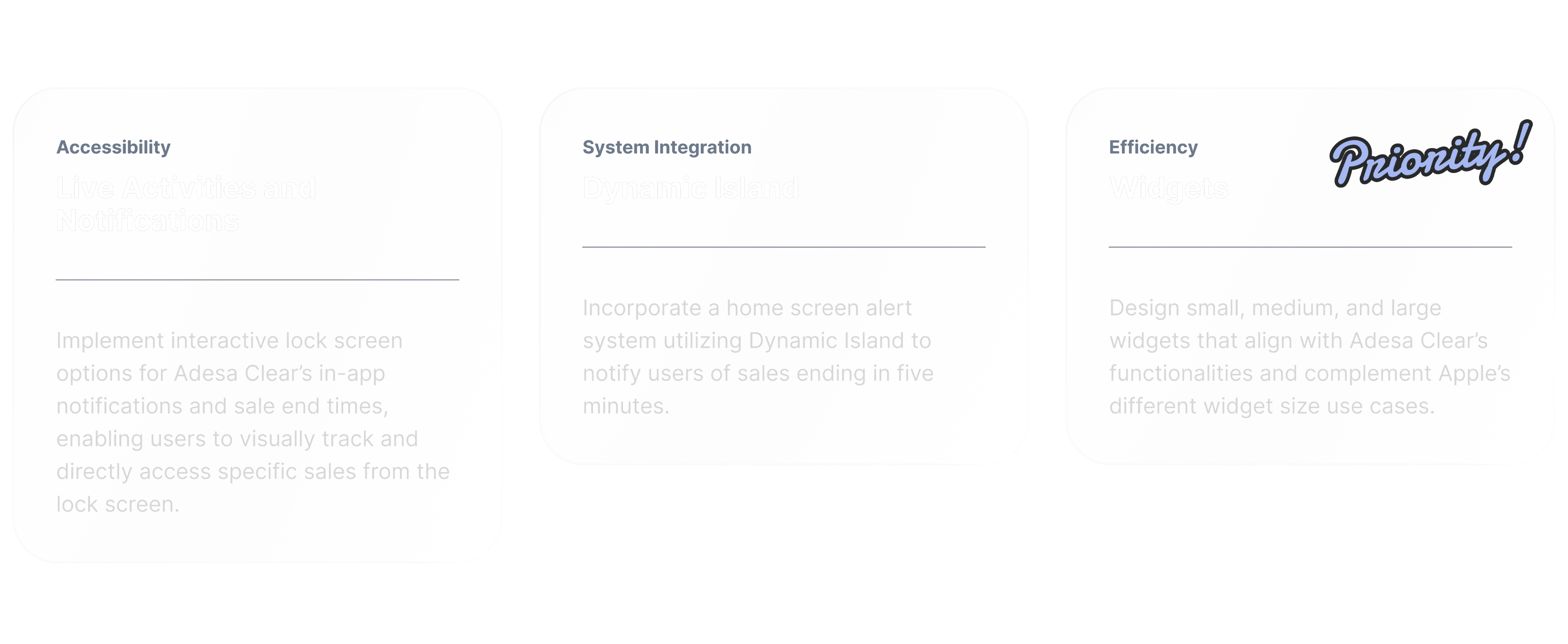
Design Goals
After project kickoff, we narrowed down our design goals into three categories that ties in with our product and user's needs.
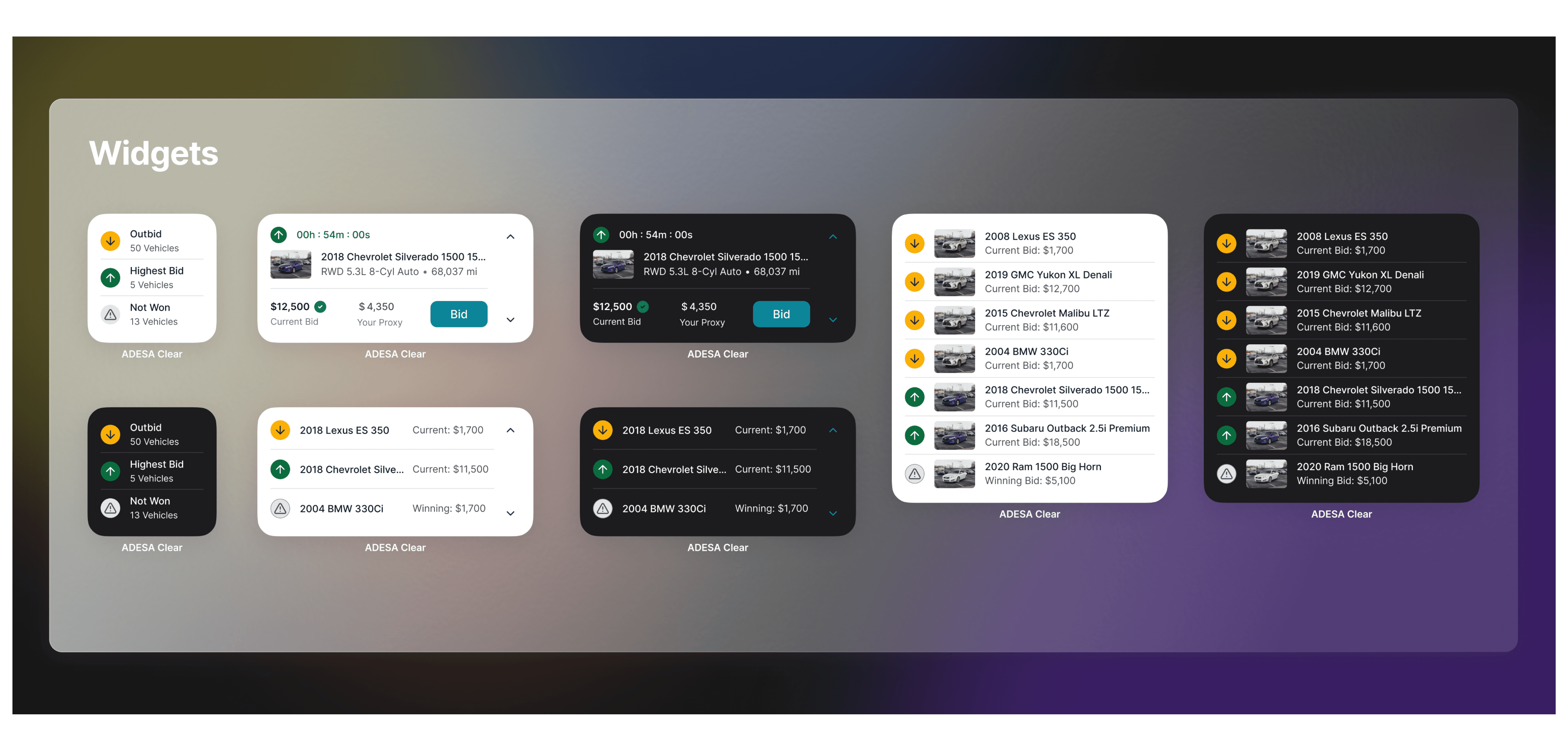
I decided to prioritize widgets before dynamic island, live activities, and home notifications because it required different sizes and layouts. I was also least familiar with it.
Dynamic island and live activities were straight forward because we decided to have those two features reflect the last 5 min of sale.
Home notification interactions were also an easy solve because the call to actions were already finalized per notification type from our past designs.
Understanding Apple's Design System
Apple has very specific rules and use cases for their widgets, dynamic island, and live activities. I was least familiar with the concept and different patterns of widgets, so I've spent the most time researching deeper into it.
Here are some of the findings of my research on widgets.
Things to consider in the ideation process
Principles
- Personal: emotional connection with a piece of the app
- Informational: commonly repeated action in the app
- Contextual: predicts the need/next steps
Things to consider in the creation process
Size and interaction of widgets
- Small: single tap target brings user to a specific part of the app, and only pack 4 pieces of info MAX!
- Medium: multiple tap targets
- Large: multiple tap targets
Things to consider in the creation process (cont.)
Content and personality
- What are people looking for when they launch the app?
- What are distinct items of info people find useful in the app?
Things to consider in the creation process (cont.)
Patterns
- Layout that expands across 3 sizes
- Completely unique across 3 sizes
Recognizing Patterns
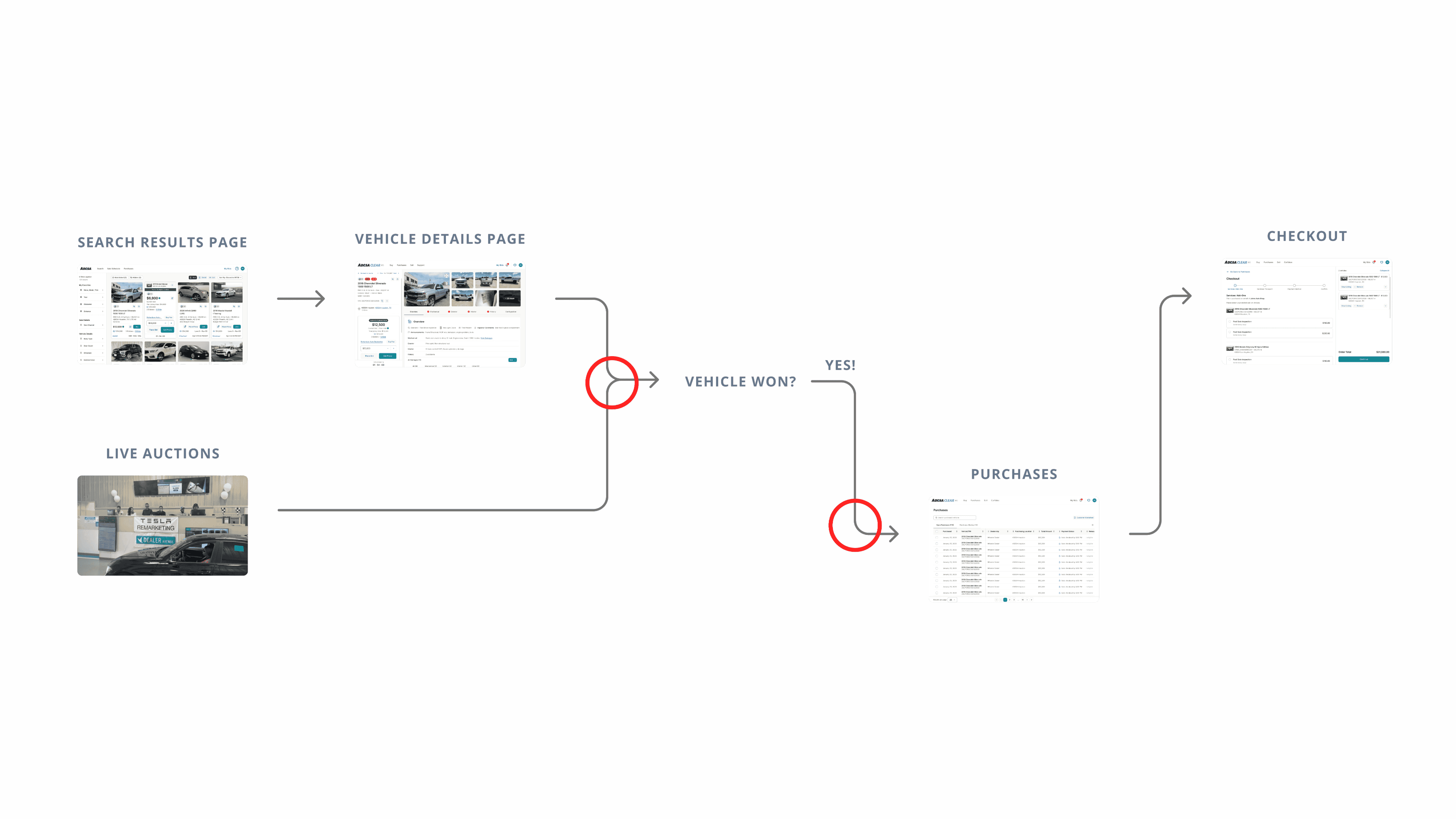
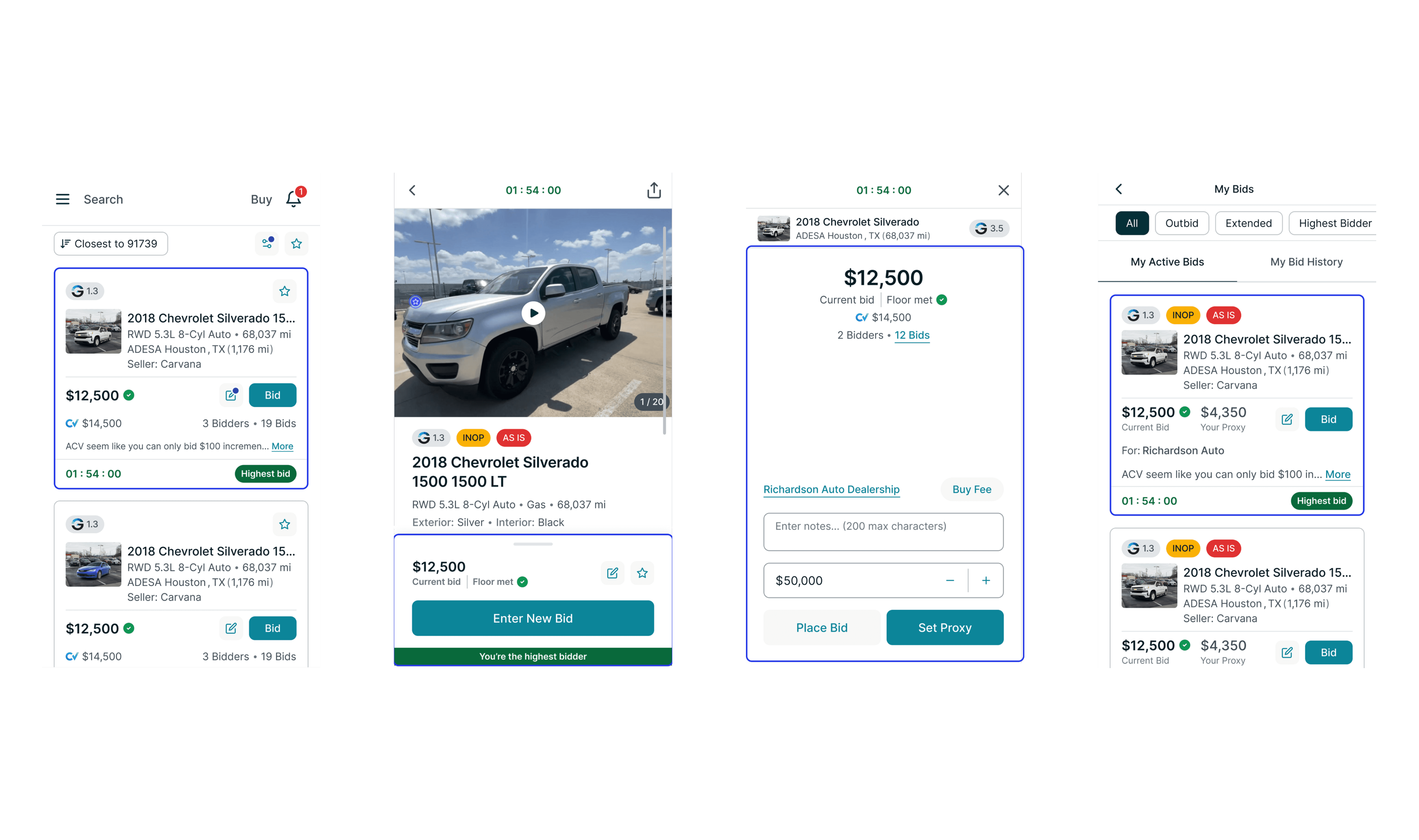
Across our web and mobile bid cards on the search results page, vehicle details page, and bid management, there are consistent patterns in how bidding amounts, year/make/model, and bidding status are grouped. These elements are placed in close proximity to one another and are the key details dealers focus on at first glance.
These are the bid cards across web:
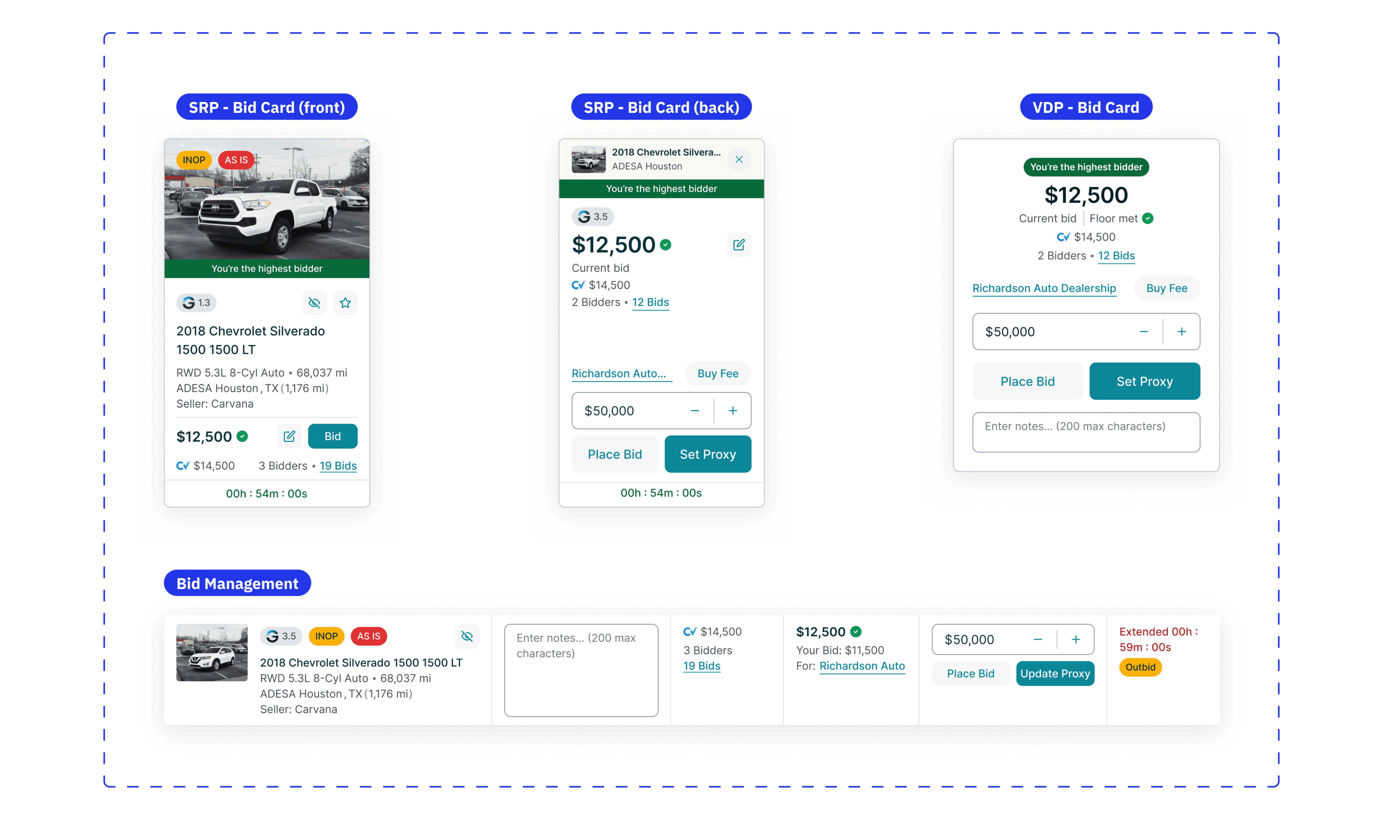
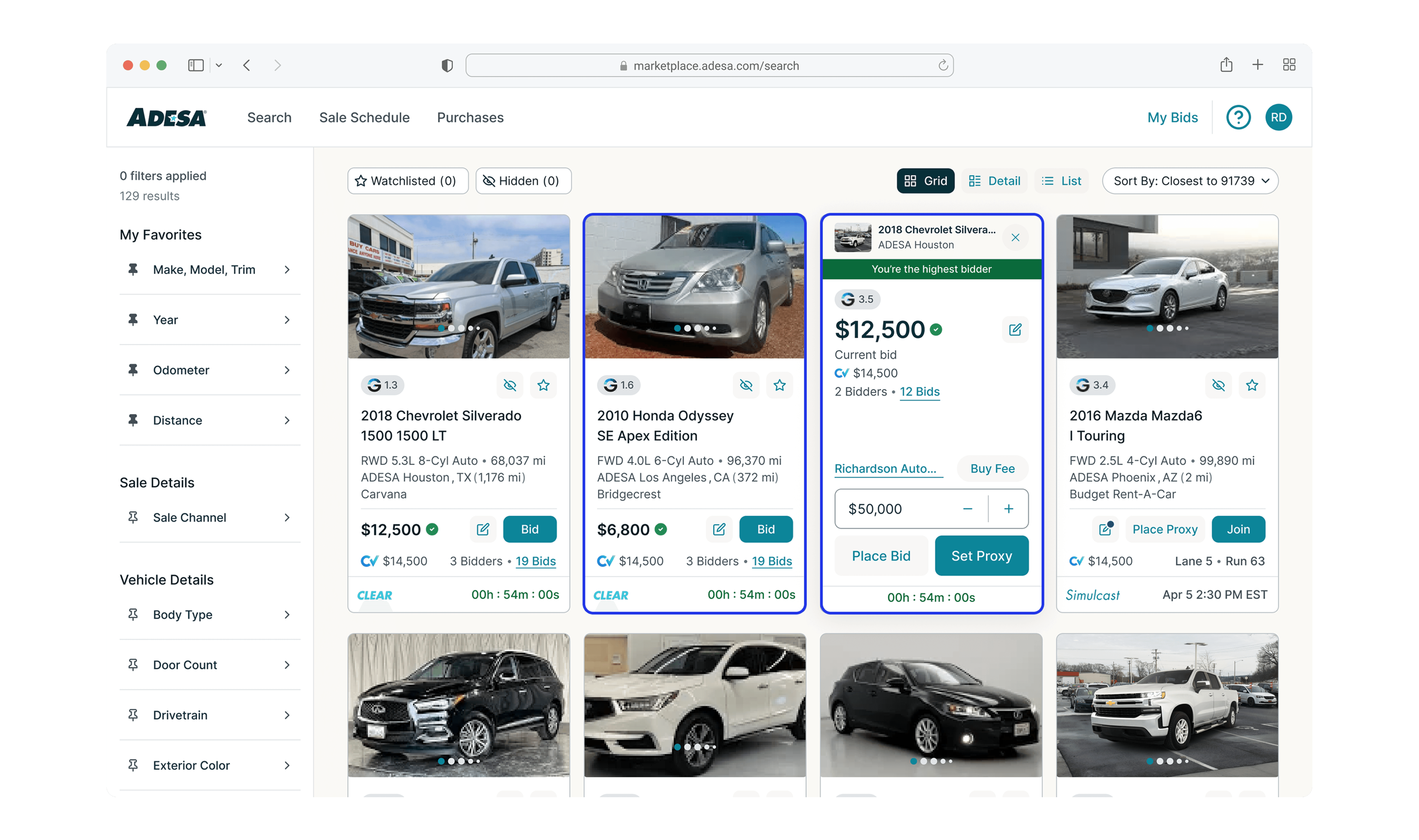

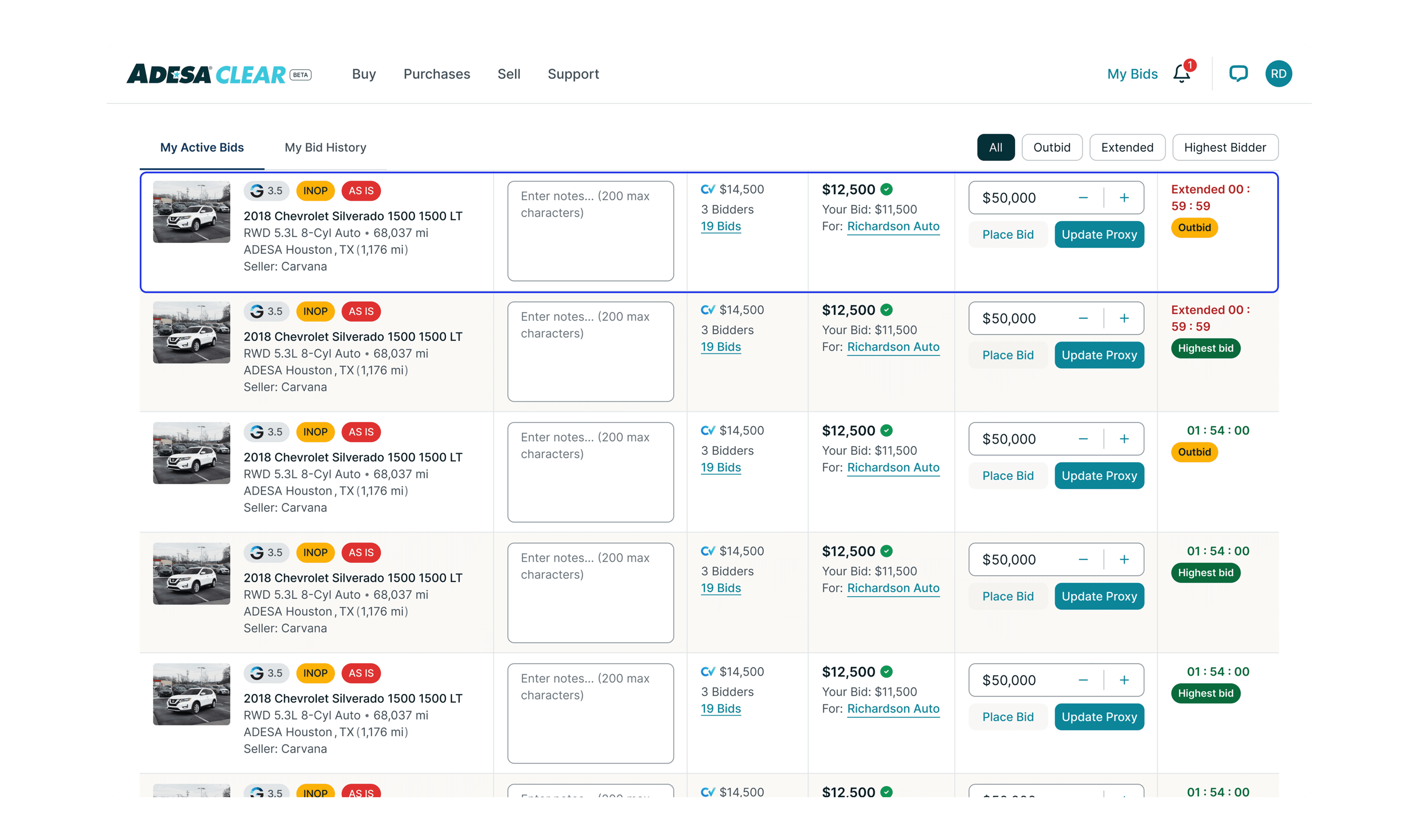
And these are the bid cards across mobile:
I decided to prioritize widgets before dynamic island, live activities, and home notifications because it required different sizes and layouts. Dynamic island and live activities were straight forward because we decided to have those two features reflect the last 5 min of sale. Home notification interactions were also an easy solve because the call to actions were already finalized per notification type from our past designs.
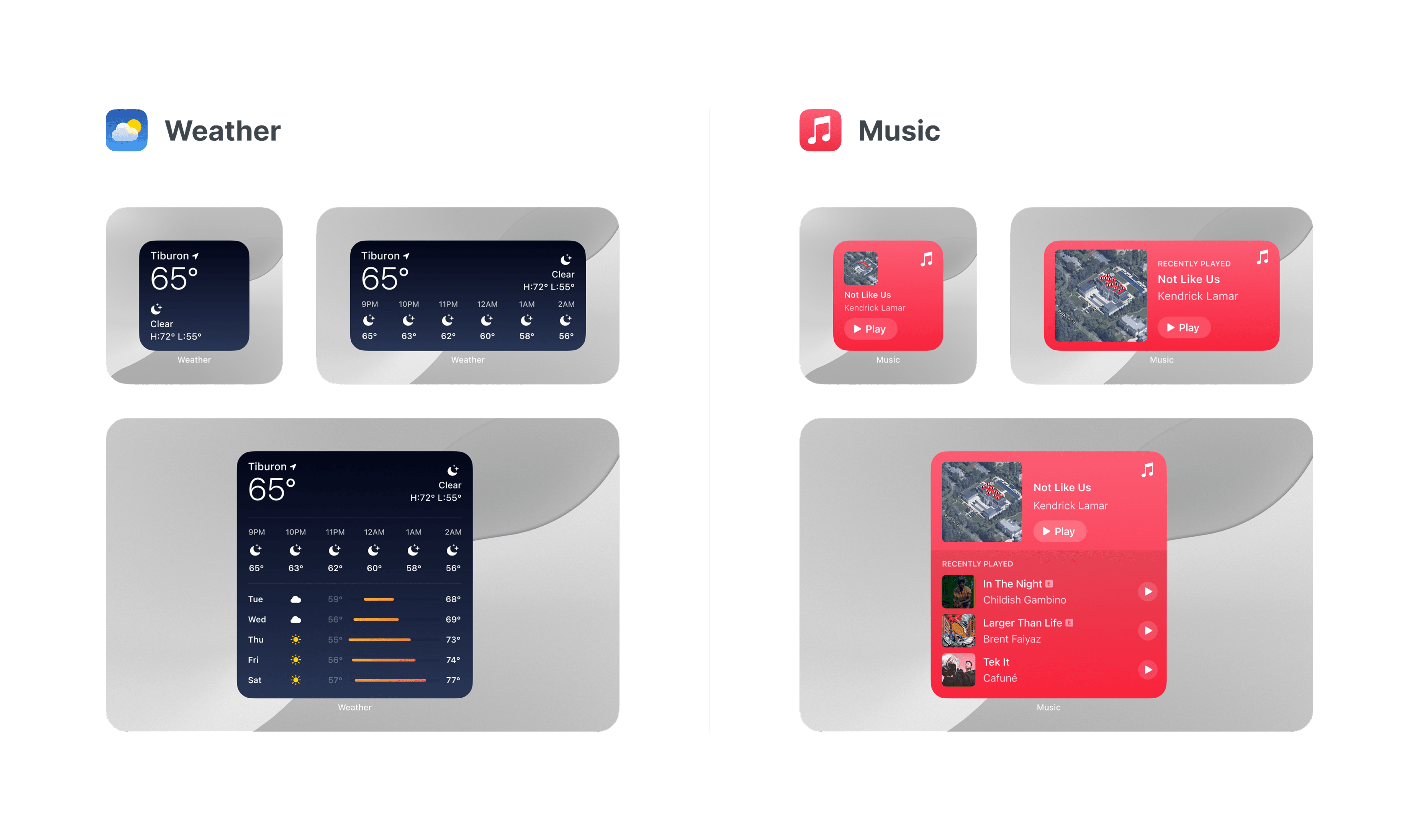
Widget Iterations
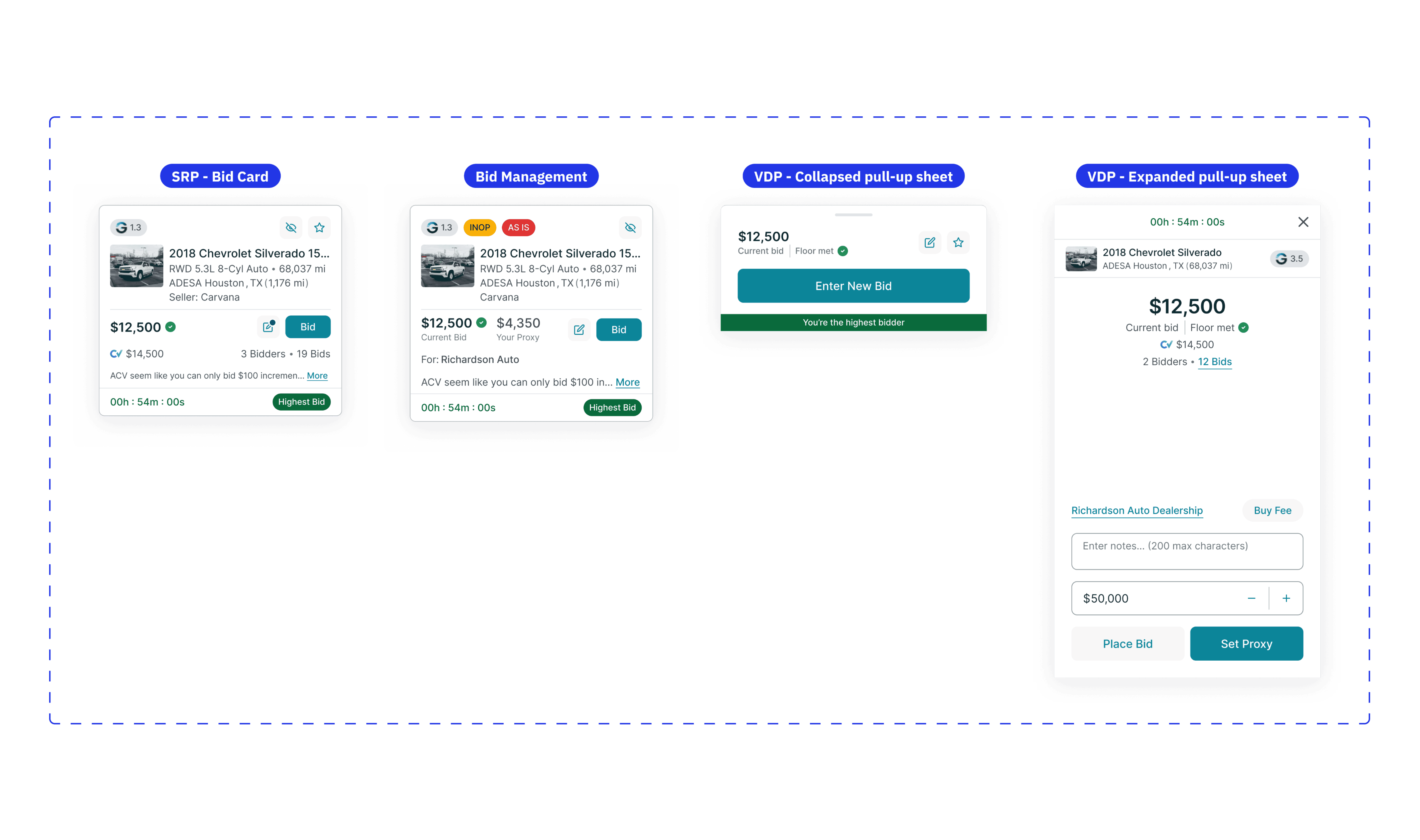
Within a week I went through multiple design iterations, incorporating feedback from stakeholders and continuously returning to the drawing board to explore different design approaches. Considering the patterns of our bid cards, I began exploring how widgets could serve a meaningful purpose.
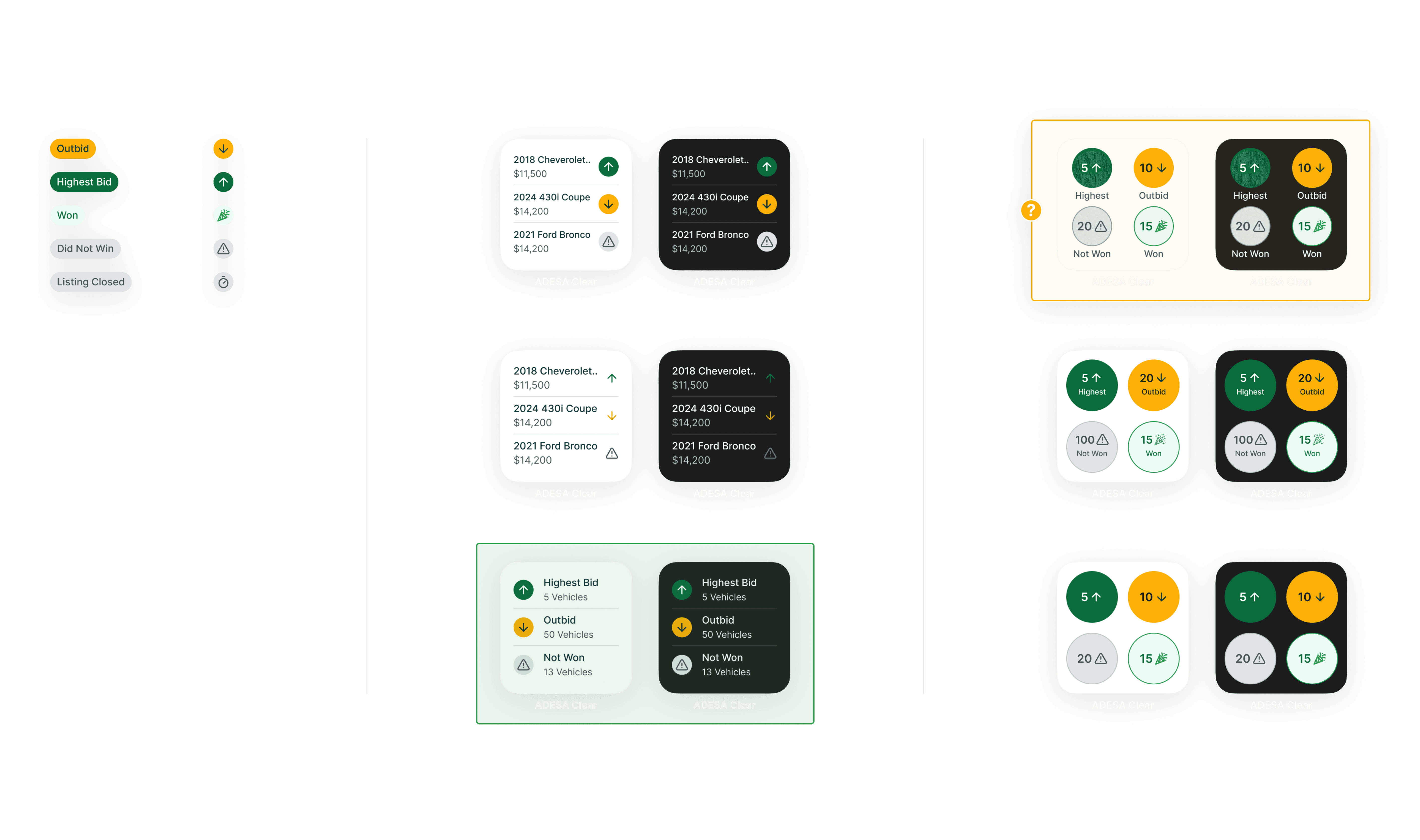
These are the explorations for small widgets. On the left I converted the bid status badges to smaller icons to be expressed better in tighter widget spaces. The green selection highlights the option that was most liked by all, and the orange was a 'maybe' choice.
Due to space constraints, it was more efficient to provide a high-level summary of the number of vehicles categorized by bidding status rather than listing each vehicle individually. It would be ordered from the most time sensitive (Outbids) to least (Listing Closed). The layout of the green selection not only captured this effectively but also aligns with studies showing that users tend to focus 80% of their attention on the left half of the page and only 20% on the right, reinforcing the design's strategic placement.
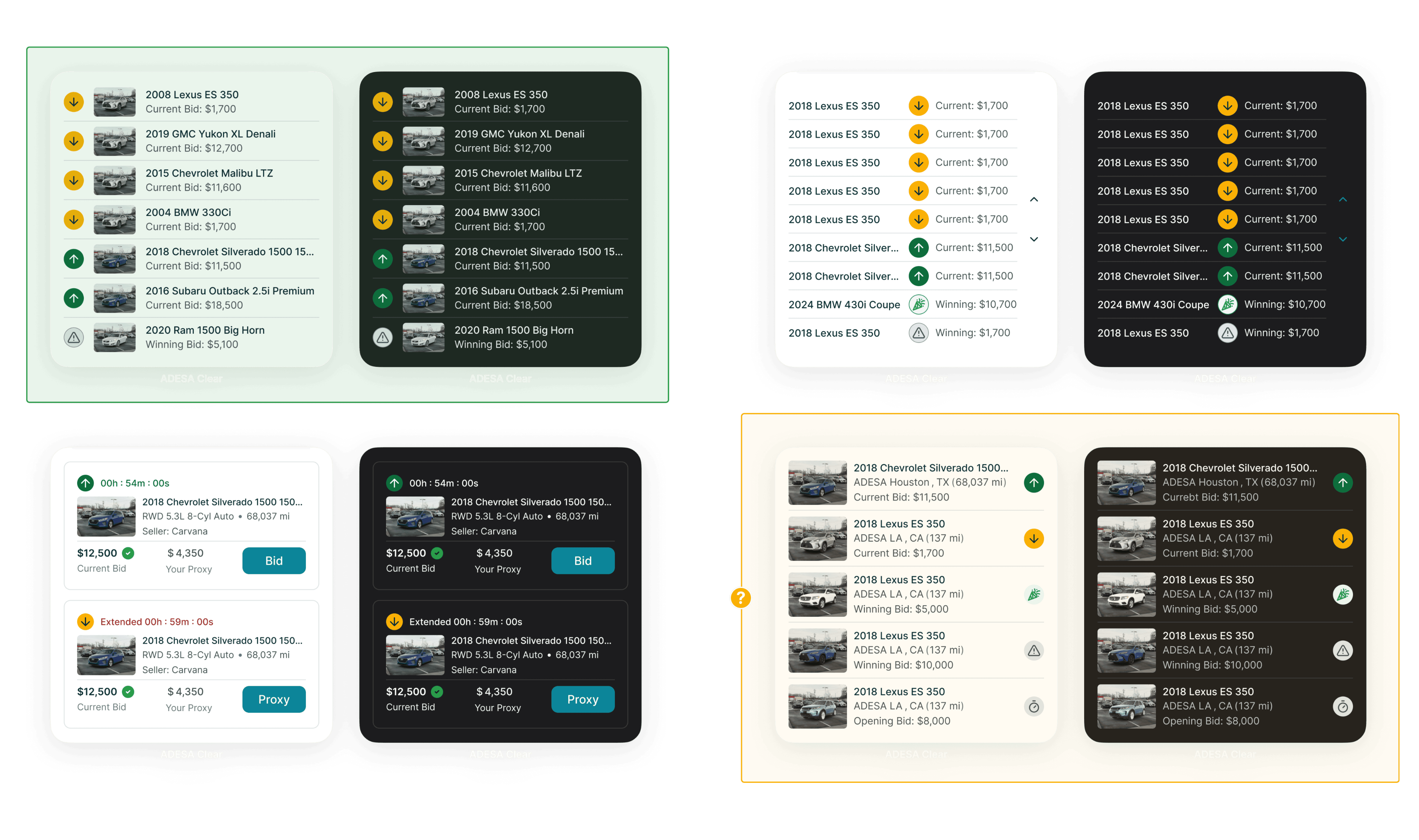
In the explorations for medium widgets, there were 2 versions I explored that reflected the Search Results Page and Bidding functions. The left side shows version 1 and the right, version 2.
Version 1's orange selection was a popular choice by stakeholders because it was a more compact view. However, because medium widgets have the functionality to have more than 1 tap area, making the space more breathable and finger friendly was priority. It read better from left to right, and the up and down carot buttons gave flexibility for our users for more listings.
Version 2 came together quite easily. I referenced Adesa Clear's mobile bid management cards and took some pieces out, where users can view more listings through the right buttons or press 'Bid' to open that vehicle listing on the app.

Lastly, large widgets.
We opted for a design with a denser information layout, displaying only the essential details. While larger images would have been a nice addition, showing more listings within the large widget framework better supported our workflow.
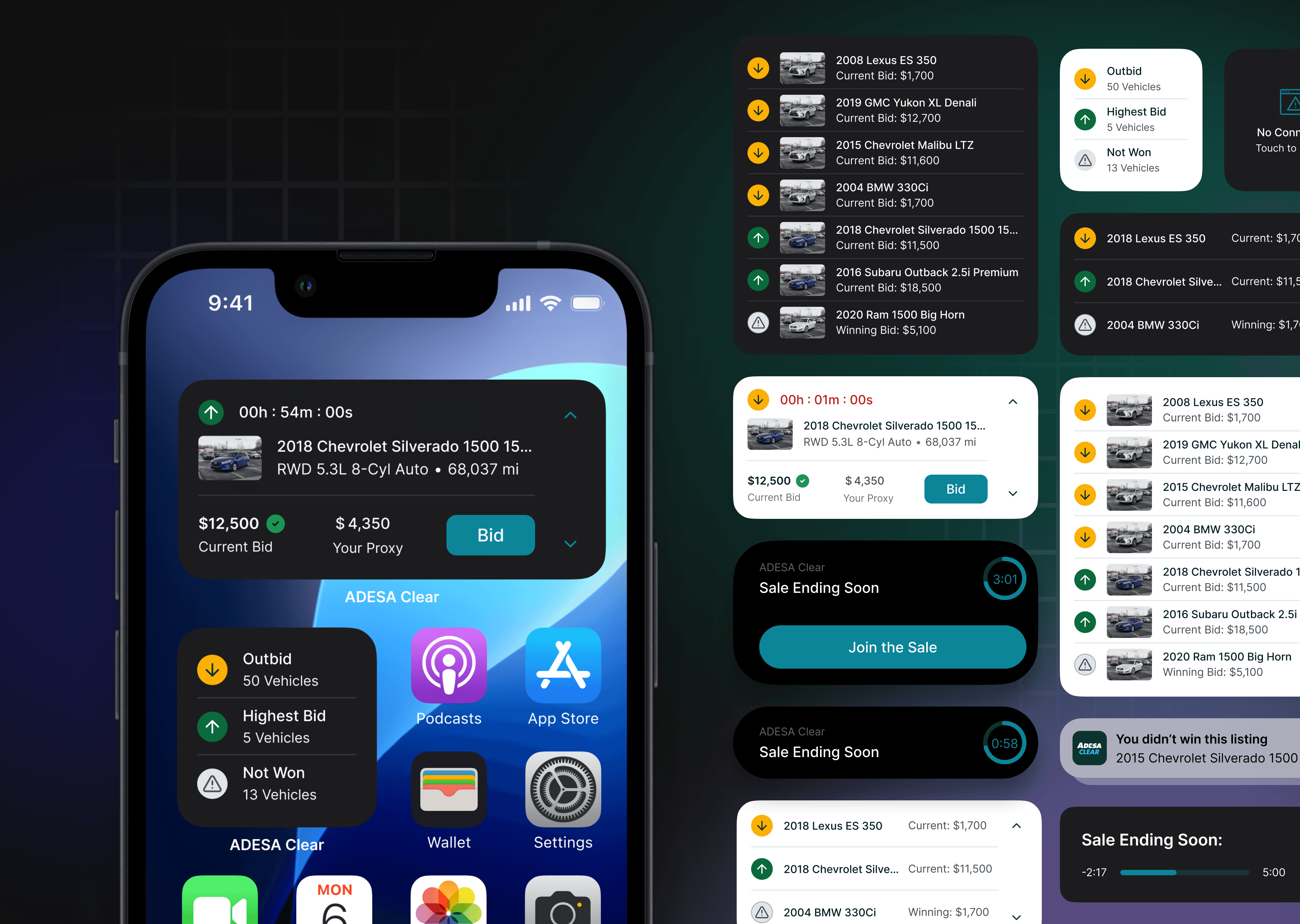
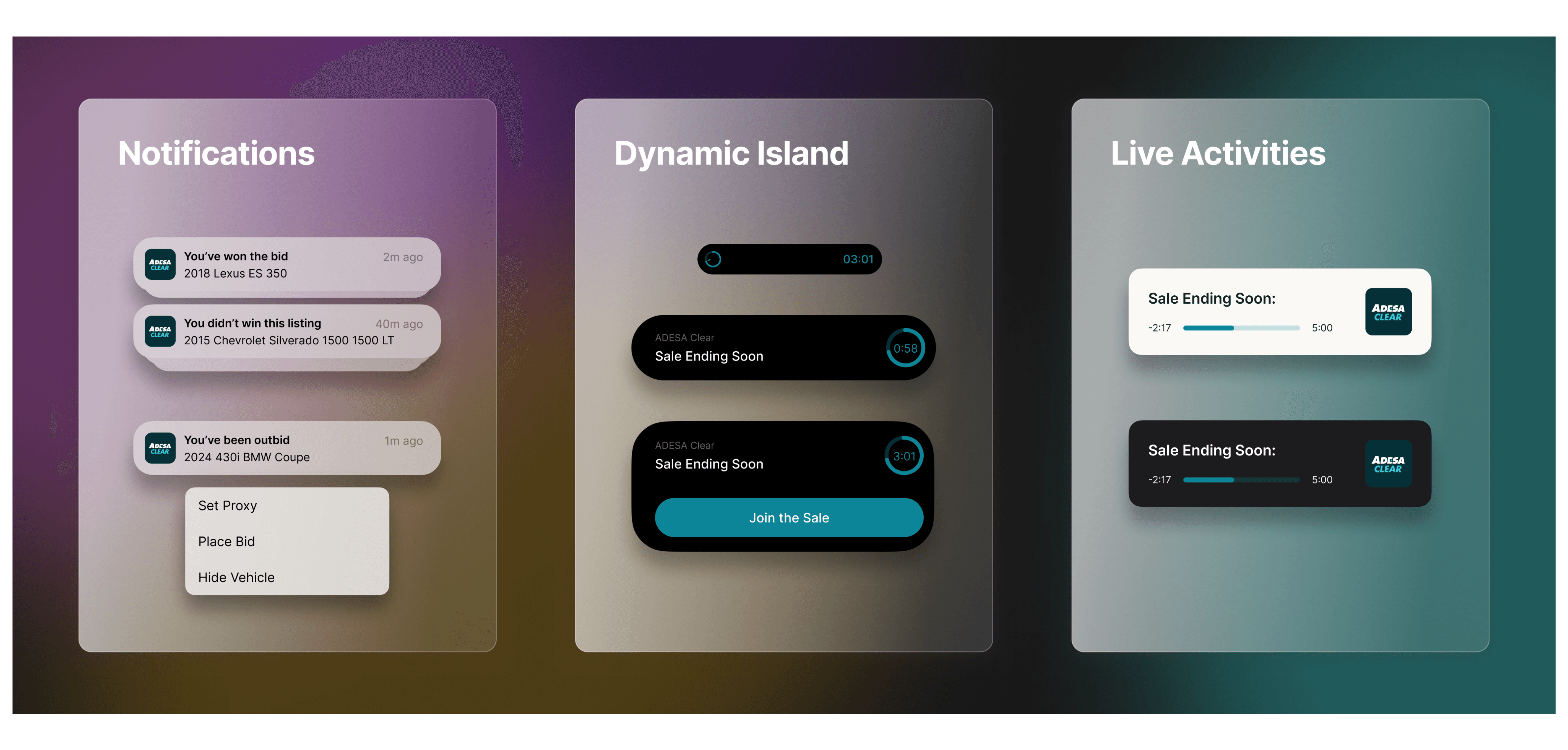
Dynamic Island, Live Activities, Home Notifications
Dynamic island and live activity designs reflect the last 5 min of sale. Explorations were more simple and straightforward, with less guidelines to follow.
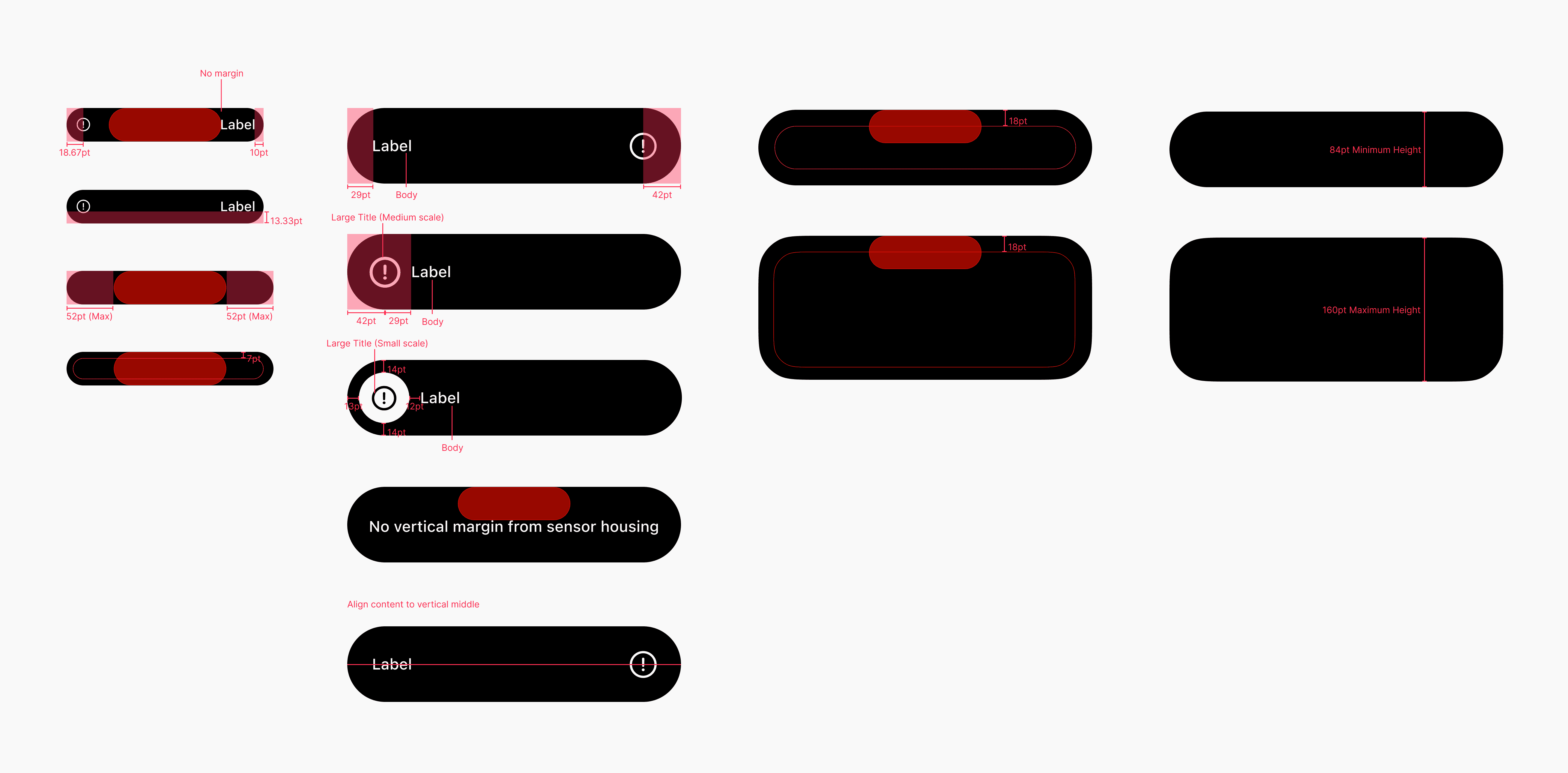
This was the nitty gritty guidelines of dynamic island:
Live activities guideline was straightforward: maintain 24px padding around all borders. Here's some explorations for dynamic island and live activities. Tapping on any of the surface would lead the user directly to 'My Bids' page.

For home notifications, a long press reveals a dropdown of CTAs, each directing users to the SRP, VDP, Purchases, or Checkout page.

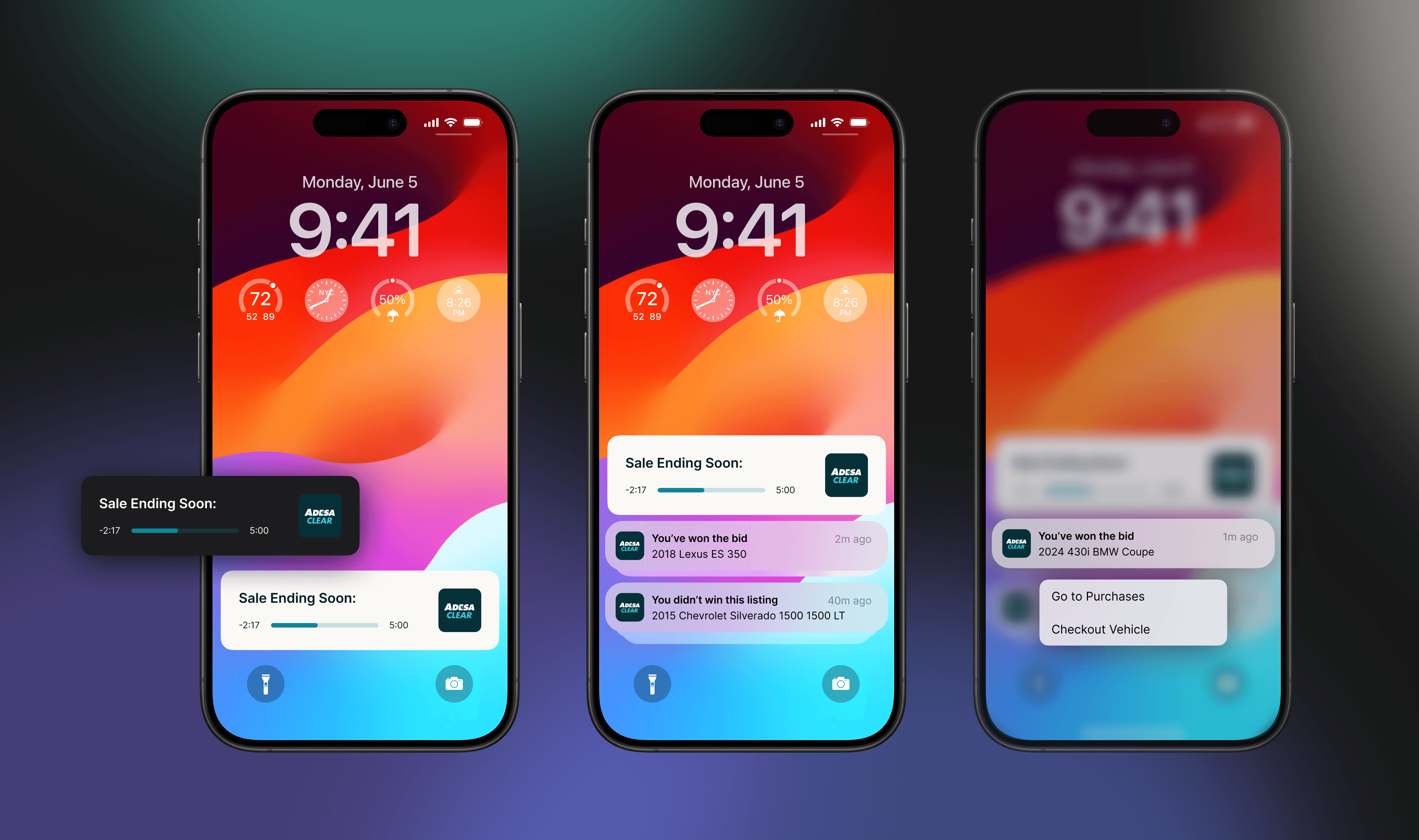
Final Designs
None of our competitors utilize IOS features. As the first auction platform to integrate iOS features, it put us at a huge advantage for being a tech-forward company.
Widgets don’t update in real time; instead, they refresh every few minutes or hours. This is where Dynamic Island and Live Activities bridge the gap, acting as real-time alerts in the final five minutes of a sale. With interactive and easily accessible features on the lock and home screens, users stay more engaged and are alerted in real time!
The video is a happy path of installing the widgets on home screen. The screens are what notifications, dynamic island, and live activities will look like in situ!

Qualitative Project Impact
Although I wasn't present to see this project go live and collect quantitative data, some qualitative data were:
👥 Qualitative Insights
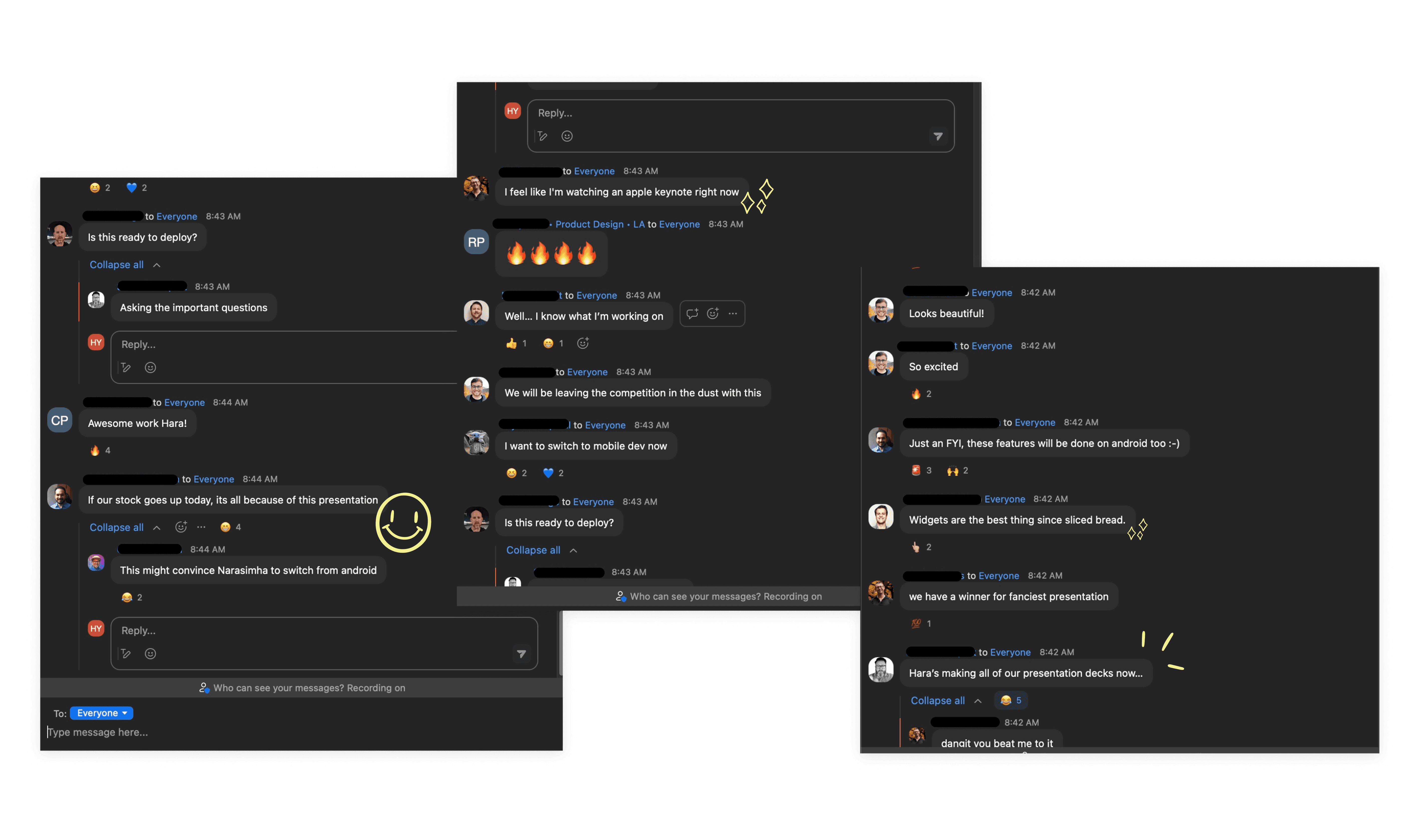
High engagement and excitement from our monthly Marketplace demos, and design reviews!
Positive feedback loops throughout collaboration with product and engineering.
📈 Business Impact
Increased trust and retention: Clearer vehicle information reduces confusion, leading to more confident purchases.
Operational efficiency: Better clarity supports faster decisions for repeat vehicle buyers (ex: identical units).
Revenue potential: intuitive experiences → increases trust → increases retention → higher usage and transactions overtime
📊 Opportunities for quantitative validation
Feature engagement: which iOS bidding tools were used most? Did this lead to 30% increase in biddings? Can we expand to android?
Behavioral change: engagement and drop-off before vs. after feature release
Activation speed: how quickly is the user completing a purchase after iOS feature interactions?
Reflections/Growth
Strengthen cross-team collaboration: Partner with marketing and brand to deliver timely product emails that guide users through each feature rollout. Work with brand to create a better error state design, one that reflects excitement/fun.
Expand feature coverage: Explore new environments like Standby, Night mode, and wearables (Apple watch) to meet users where they are.
Anticipate user gaps: Rethink release touch points. What if users miss the product email? How else might we inform them across the journey?