🚀 Impact - Redesigning the Adesa Clear checkout experience led to increased transaction confidence, faster bulk purchasing, and a measurable reduction in support interactions, turning a once high friction step into a smoother, revenue driving moment in the wholesale dealer journey.
Date
01/2023 - 03/2023
Role
Sole Product Designers - planning, research, execution
Team
2 PMs, NaN ENG Team, me
Understanding Adesa Clear's History
Origins & Competition
Adesa was a wholesale vehicle auction company owned by KAR Global, competing with Manheim owned by Cox Automotive.
Adesa operated both physical and digital auctions, helping dealers buy and sell used cars.
Carvana also had a wholesale inventory and the platform was called CarvanaACCESS. However, CarvanaACCESS was leveraging Manheim to sell their vehicles because Manheim acted as a storefront.
Why Carvana Acquired Adesa (2022)
Carvana needed more infrastructure to process, inspect, and deliver cars efficiently.
Adesa had 56 physical locations, providing 6.5M+ square feet for vehicle reconditioning and logistics.
Buying Adesa helped Carvana lower transportation costs and speed up operations.
What Happened After the Sale
Carvana integrated Adesa into its business, deprioritized CarvanaACCESS, and kept both physical and digital auctions of Adesa → making Adesa Clear (which became a priority)!
The Problem
Customers of Adesa Clear often become frustrated when payment issues arise, such as difficulties linking bank accounts or missing payment methods. This friction creates obstacles that may deter customers from completing their purchases.
To ensure the future success of both Carvana and Adesa U.S., it’s crucial to reduce our reliance on Manheim and KAR Global technologies and selling processes.
HMW
How might we streamline the payment process to eliminate friction and create a seamless, frustration-free experience for customers, ultimately boosting trust and increasing purchase completion on Adesa Clear?
Success Metrics
75% (3 out of 4) customers are successfully able to link their ACH account (leveraging AuctionACCESS) without needing to contact a support line.
Who's our user?
Adesa Clear is designed for dealers who thrive in the fast-paced world of auctions but also want a quick, hassle-free way to secure their vehicles after winning.
Auctions aren’t just about buying cars, they’re an experience. Dealers love seeing, smelling, and hearing the vehicles in person, feeding off the competitive energy as they bid against rivals. Once they win though, they need a seamless checkout process to finalize their purchase without delays.
Below are four main personas for Adesa Clear. People who value speed, efficiency, and a frictionless post-auction experience to keep their business moving


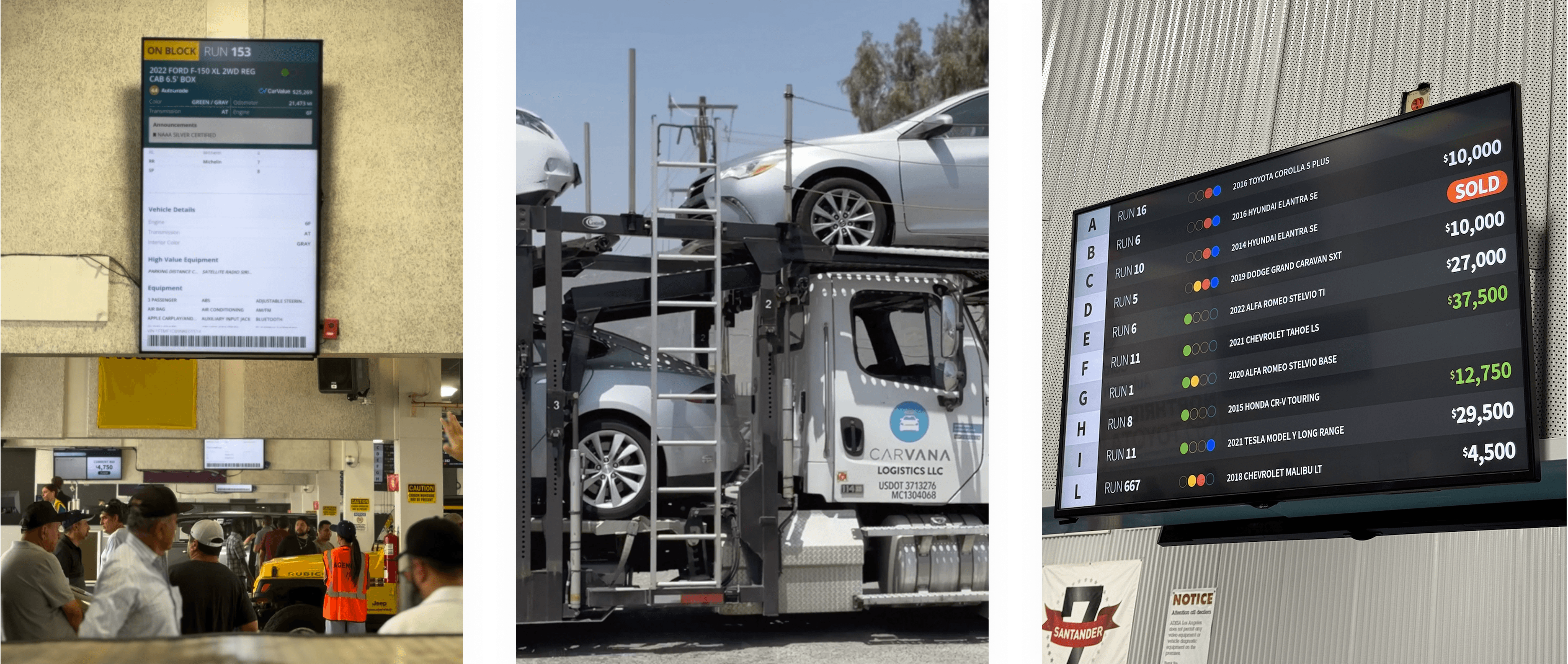
Here is a sneak peek at what the auctions look like! Auctions are loud, fun, and pure chaos. You can barely hear the person talking next to you, and at a blink of a second the vehicle you may have been eyeing can be sold to a dealership you're competing with. What a bummer!
"Dealers are creatures of habit... they like things to get set structurally and they stick with that ... and you can work with them and convince them to change their habits, if it's beneficial for them" - Jeremiah R. (Senior Manager, Inside Wholesale Operations)

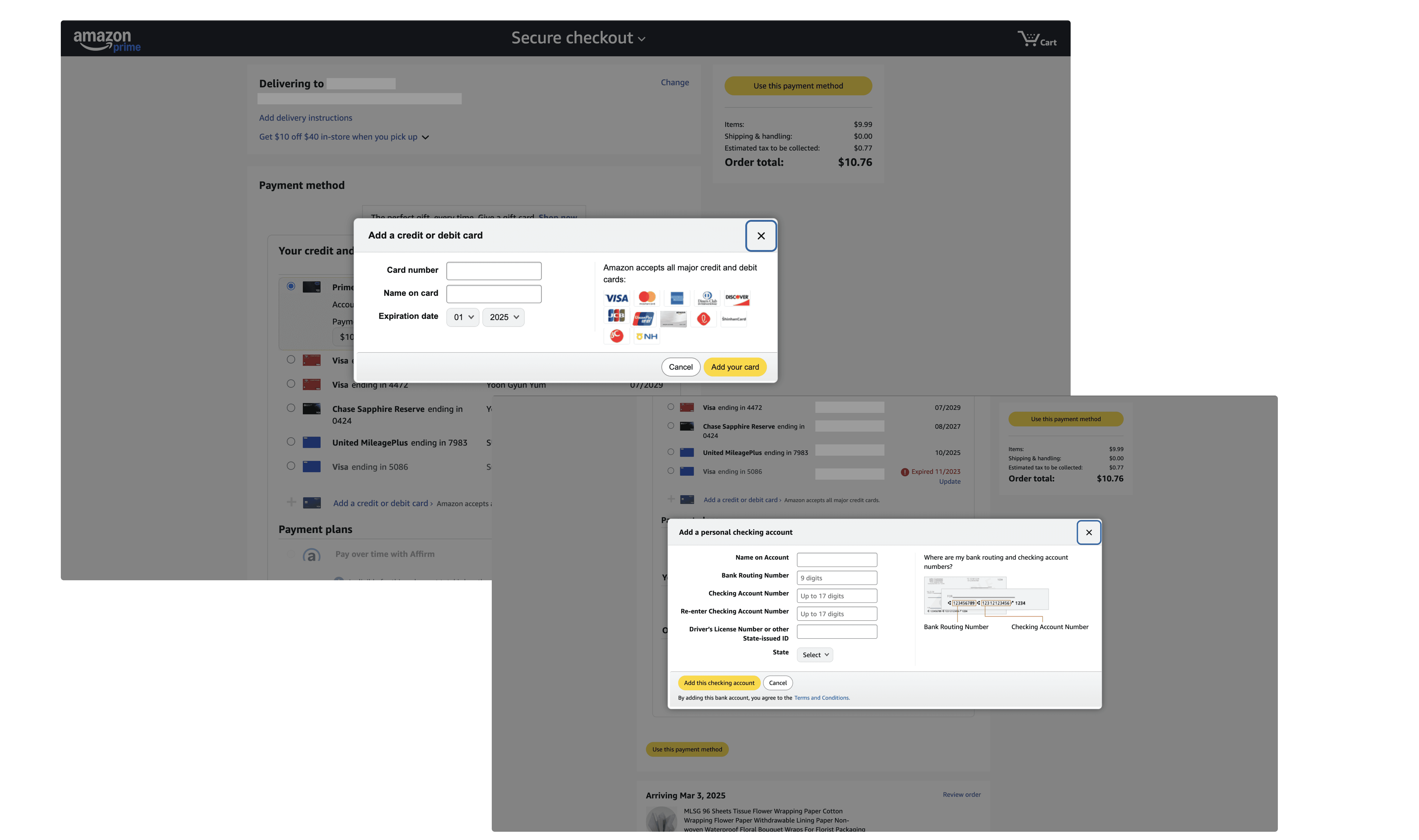
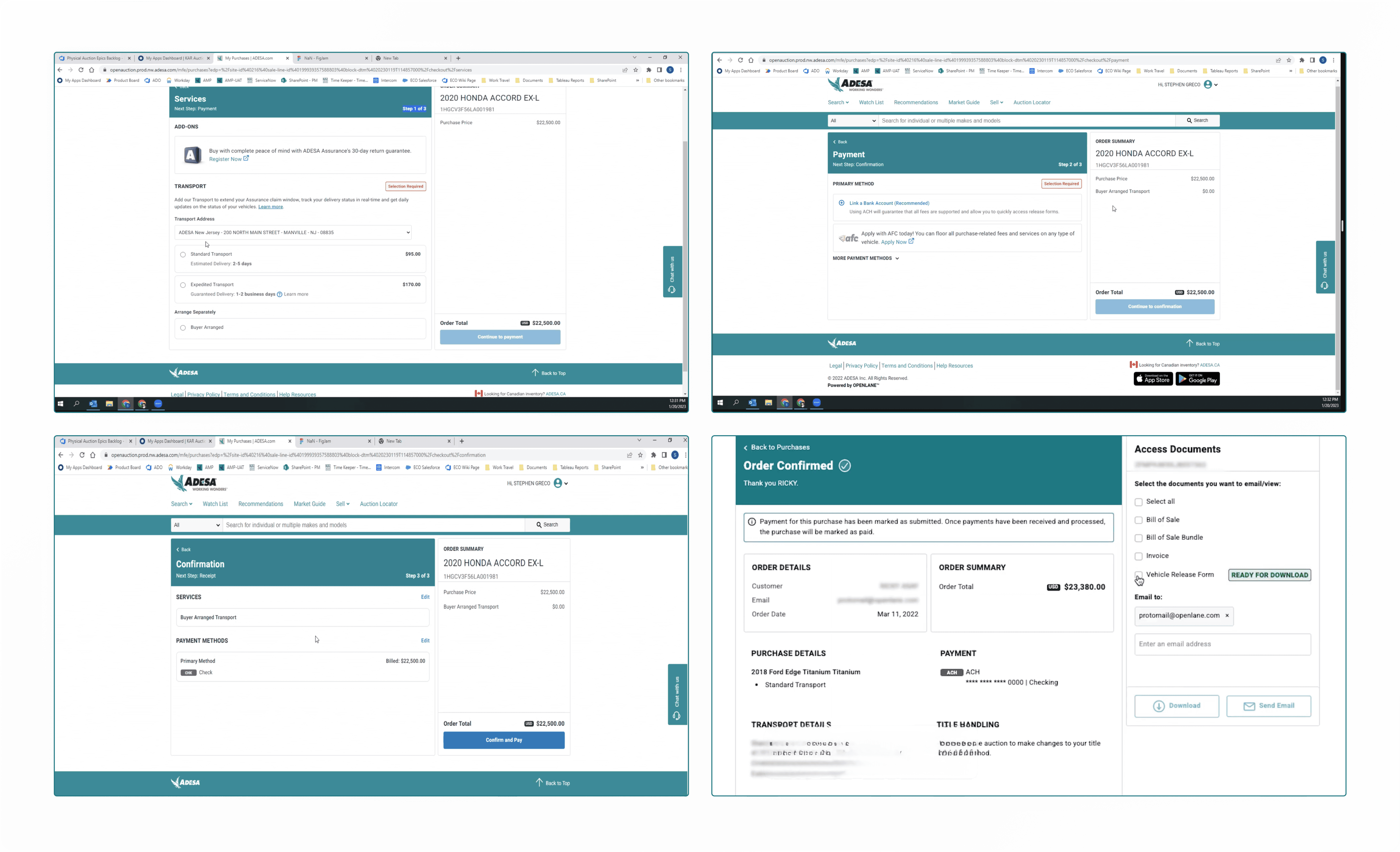
Adesa's current Checkout experience
Before designing for Adesa Clear's checkout experience, a recurring piece of feedback to keep in mind from users of Adesa's platform was the lack of transparency in pricing.
In the screens below, the layout provides clear vehicle and payment information, creating an appearance of transparency and guiding the user through the steps.
However, it lacks enough depth in the details, making it feel more surface-level despite the clarity. Key information about the purchase process and services isn't fully explored, leaving the user with gaps in understanding.
NPS - Current Checkout issues
~ 10% wanted more purchase information.
~ 8% want to choose a different pay type.
~ 11% believed that the payment process was cumbersome.
~ 7% want to pay with ACH specifically. ACH (Automated Clearing House) refers to a payment method that allows dealers to directly transfer funds from their bank accounts for purchasing vehicles. This electronic payment system is commonly used in B2B transactions to facilitate secure, quick, and cost-effective payments without relying on credit cards or paper checks.
~ 36% said there was a long wait time and difficulty accessing gate pass. Gate Pass in ADESA Clear is a document or digital authorization that allows dealers to pick up their purchased vehicles from an auction location. It serves as proof of payment and ownership, ensuring that only authorized buyers can remove vehicles from the auction facility.
Our Design Goals
Building on the insights from our indirect competitors as well as Adesa's current checkout designs, we gained a deeper understanding of users' frustrations and challenges in a typical checkout experience. This allowed us to lay the foundation of our design priorities.
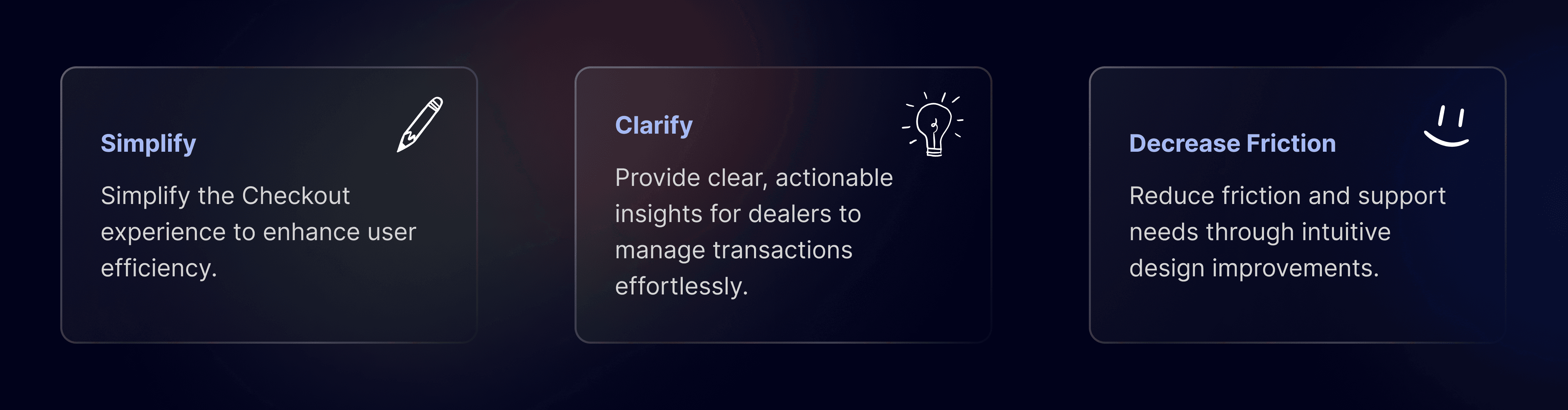
These goals ensure our solution not only meets user expectations but also aligns with Adesa Clear’s business objectives by streamlining the purchasing process, increasing dealer confidence, and driving higher transaction volume. By simplifying checkout, providing clarity, and reducing friction, we empower dealers to buy with ease, ultimately strengthening their loyalty and engagement with the platform.
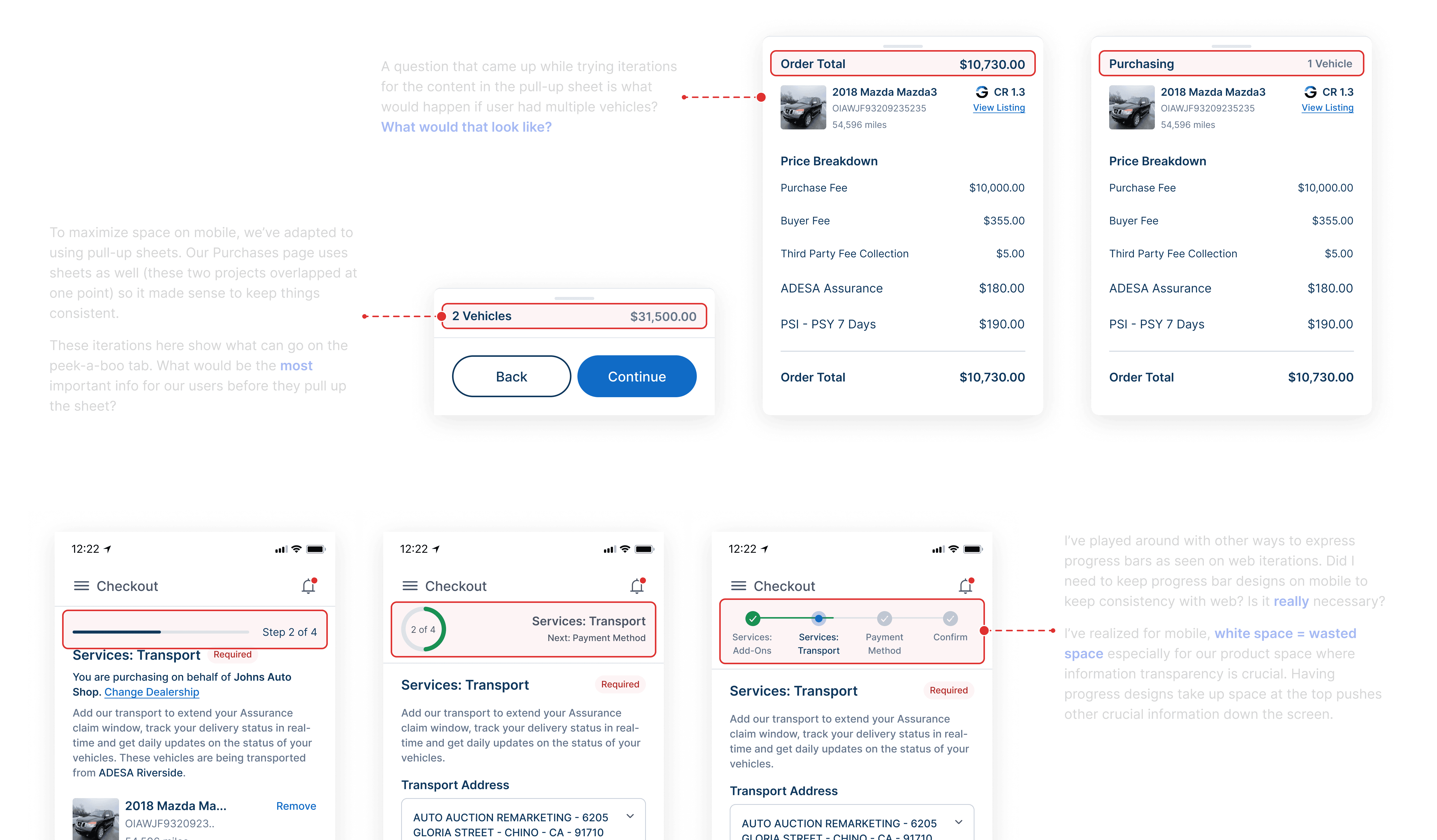
Early Explorations - Web
Here are some early iterations of Checkout's web page. I've referenced Adesa's Checkout designs as I started designing along with common indirect competitor features.
Early Explorations - Mobile
For mobile iterations, these are some of my thoughts while designing certain parts of the screens. Space and information hierarchy was the main concern.
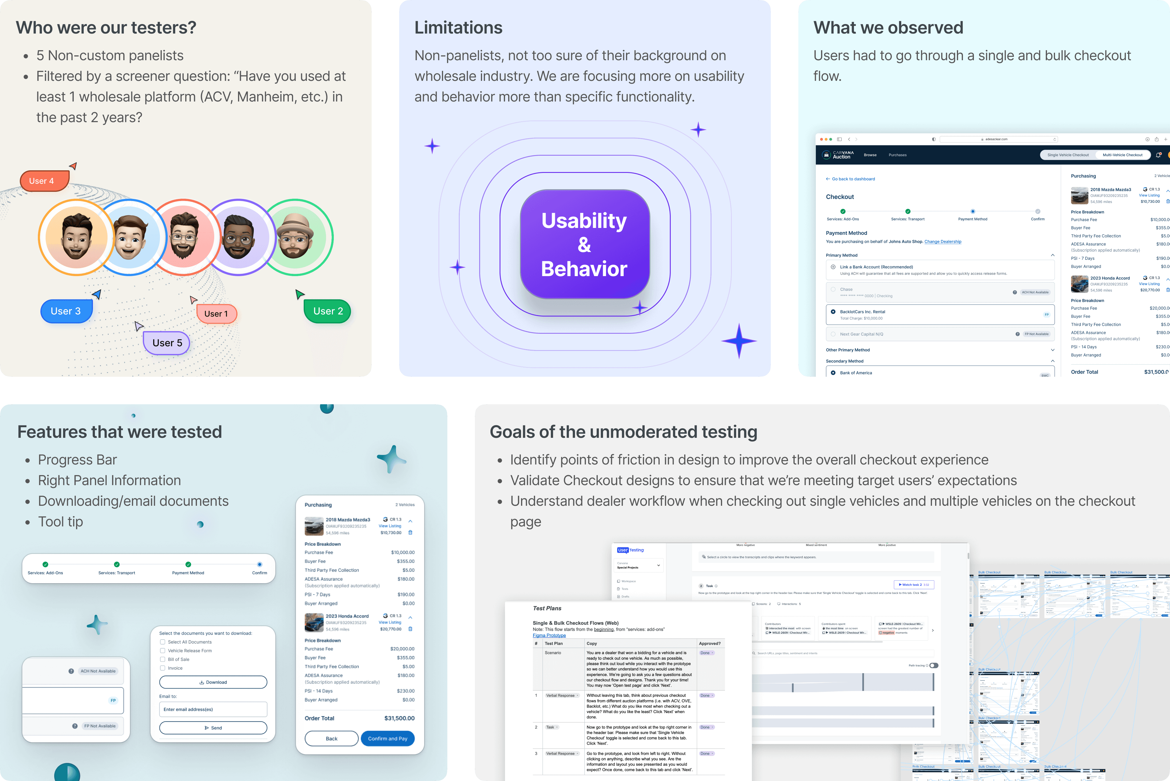
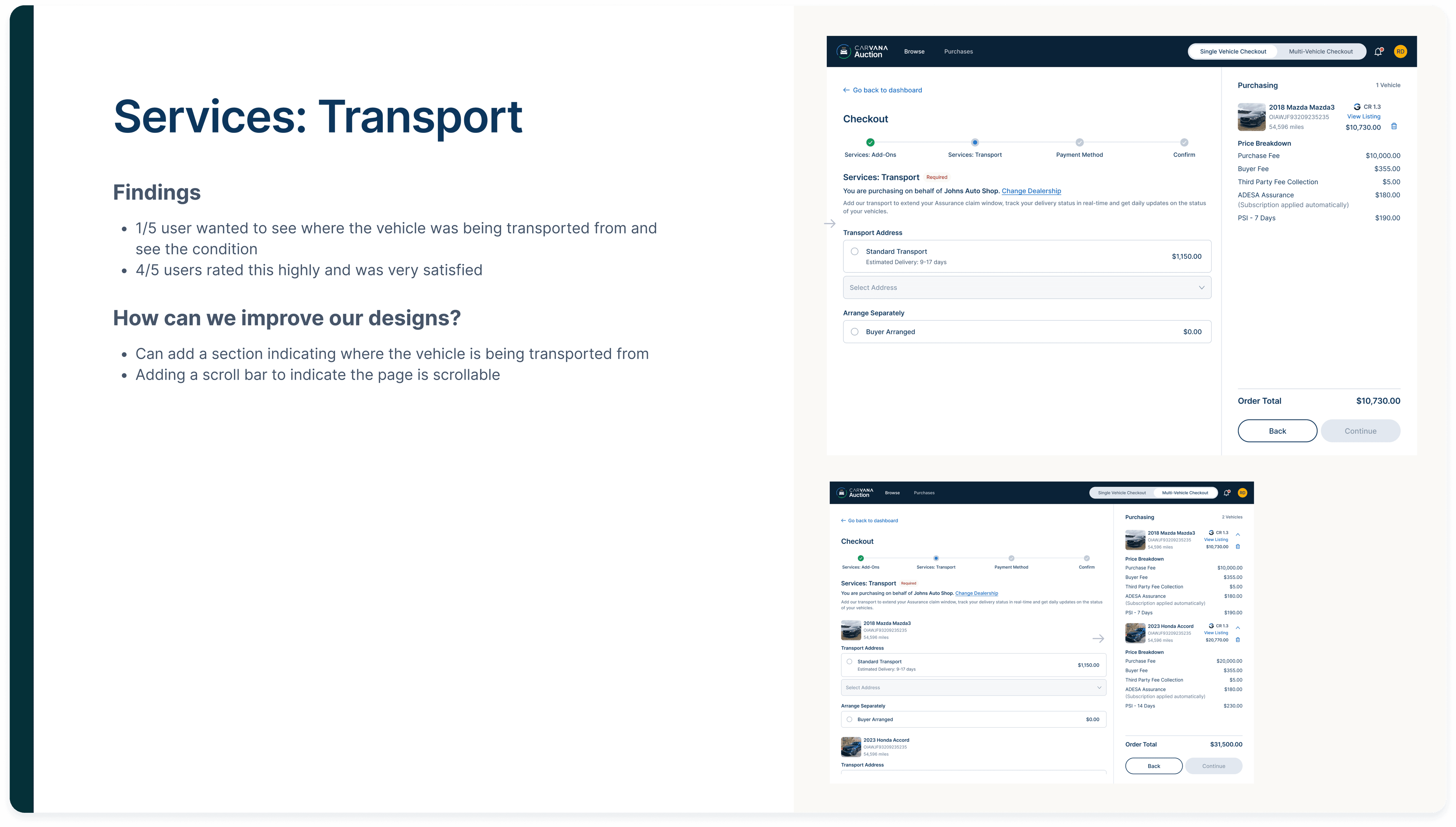
Unmoderated User Testing
Once I finished prototyping the MVP, I prepared for an unmoderated user testing session to gather insights on usability, identify pain points, and validate whether the design met user expectations.
Here’s a high-level summary of the guidelines and content for our unmoderated user testing. And below are the findings in depth.


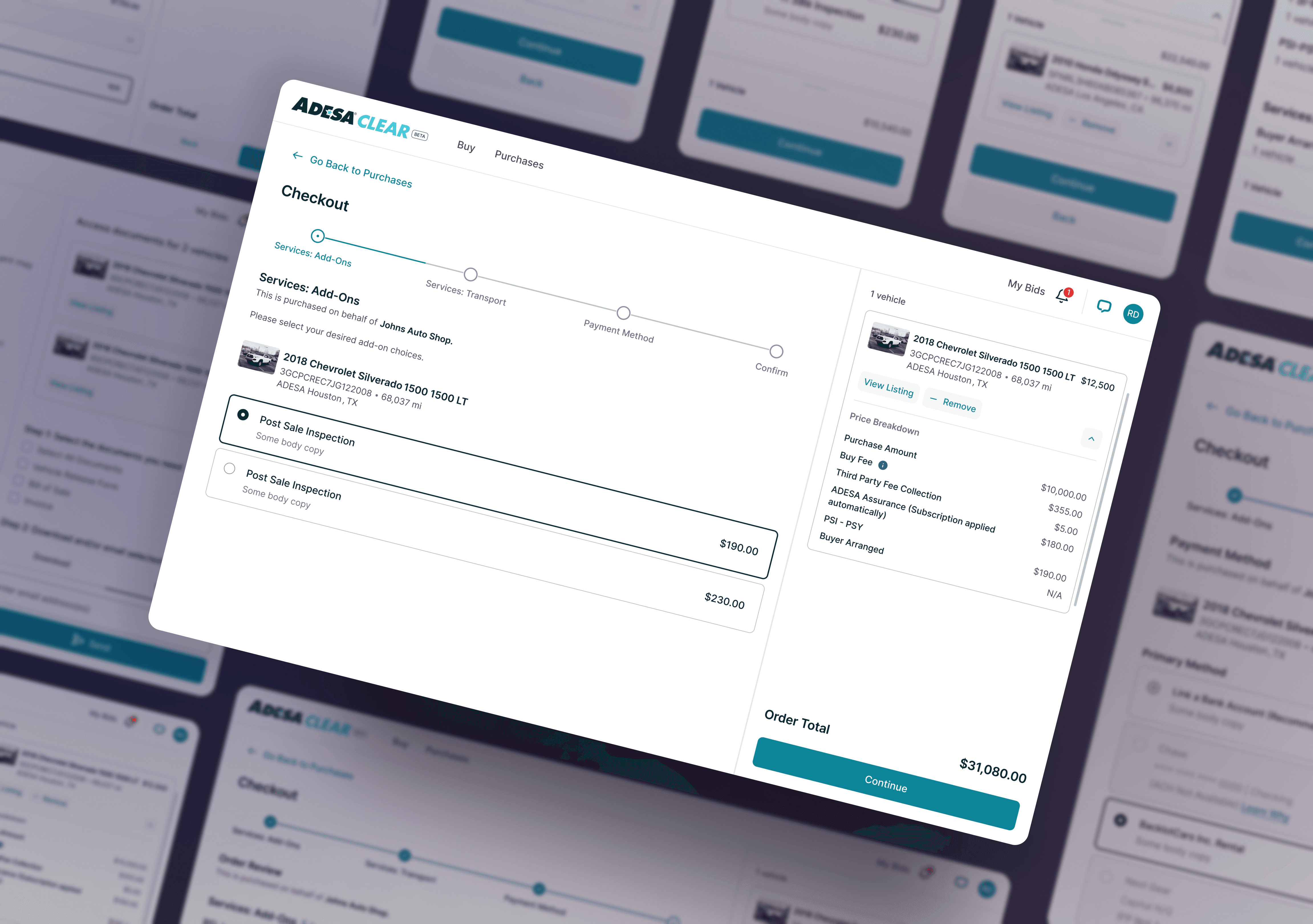
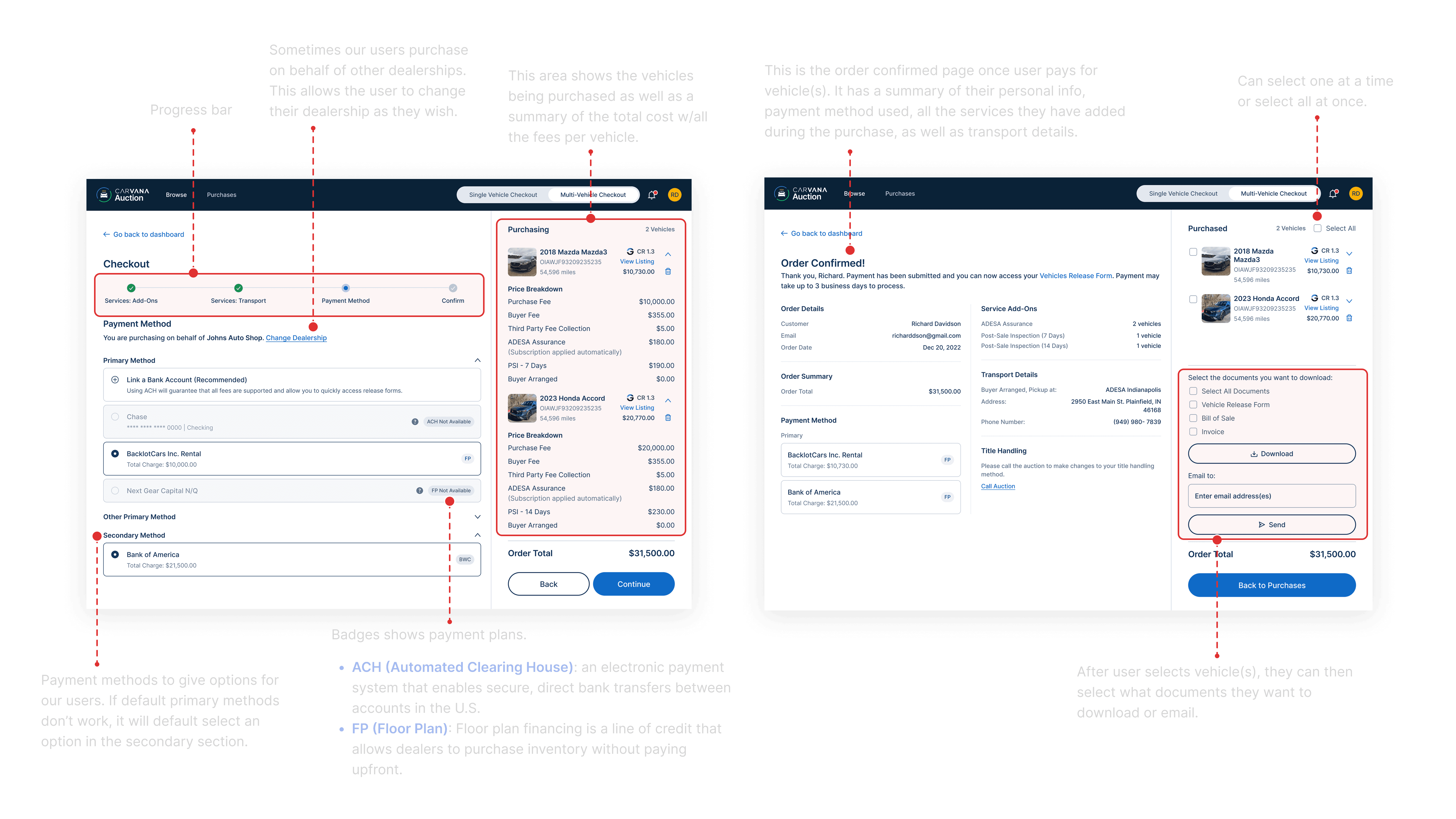
Final MVP Product
Here is the finalized happy flow for web and mobile app!
Reflections
Throughout this project, I learned the critical importance of user testing in enhancing product quality. By engaging with users, we uncovered gaps in our designs that we hadn’t anticipated, allowing us to swiftly iterate and improve based on real-user feedback. This process not only refined the product but also reinforced the value of user-centered design in driving meaningful improvements.